Submitted almost 4 years agoA solution to the QR code component challenge
QR Code Page Using Flexbox
sass/scss

@jesuisbienbien
Solution retrospective
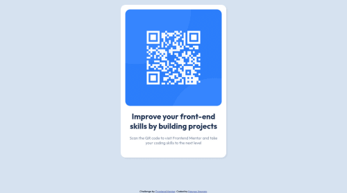
Hello, I've tried my best to recreate this webpage. This is my very first project and I have a few things I'm not satisfied with and would love to receive feedbacks on
- My container's still bigger than I wanted it to be, what's the best solution to make it smaller?
- The blue background of the qr code has 2 shadows which I have no idea what it's called and how to do it. I'm happy to receive feedbacks on any other things too. Thank you!
Code
Loading...
Please log in to post a comment
Log in with GitHubCommunity feedback
No feedback yet. Be the first to give feedback on Nguyen Nguyen's solution.
Join our Discord community
Join thousands of Frontend Mentor community members taking the challenges, sharing resources, helping each other, and chatting about all things front-end!
Join our Discord