Skip to content
  • Unlock Pro
  • Log in with GitHub
Solution
Submitted about 1 year ago

QR code page using Flexbox

Annas-khan•120
@Annas-khan
A solution to the QR code component challenge
View live sitePreview (opens in new tab)View codeCode (opens in new tab)

Solution retrospective


What are you most proud of, and what would you do differently next time?

I was able to code most of it on my own didn't need much help.

What challenges did you encounter, and how did you overcome them?

Challenges faced -

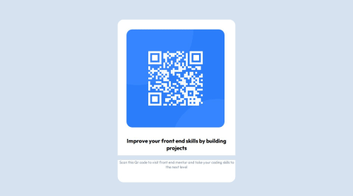
  1. not able to quite spread the image in the div container as shown in the preview photos
  2. Had problem commiting changes in github
What specific areas of your project would you like help with?

with the css part

Code
Select a file

Please log in to post a comment

Log in with GitHub

Community feedback

  • Alex•2,010
    @AlexKMarshall
    Posted about 1 year ago

    Ok, lets break this down into HTML and CSS, HTML first

    • Every site must have a <main> element, which contains all the main content for the page, but excludes content that repeats across multiple pages, such as the site header, footer and main navigation.
      • As this is is a single component challenge, and doesn't have any headers, the whole component should be inside <main>. You have a div with a class of main, but a div on its own is not a semantic element, so replace that with <main>
    • You have unnecessary elements. This challenge only really needs (inside of <main>) a single div for the card component itself, and then an <img> a <h2> and a <p> inside that. All the extra wrapping divs are unnecessary and cause extra noise and styling difficulties
      • Always try and use the minimum number of elements, only add any extra ones if you really need them
    • the <br> is especially unnecessary because it's causing the styles to break too. There's almost never a need to use the <br> element and definitely not in this challenge

    Now the CSS

    • The main problem here is inappropriate units. You generally want to avoid vh or vw as it gives you very little control. For instance what does 83vh mean? 83% of the height of the screen - but how high is that? Your screen is likely different to mine, everyone's is different. So is that an appropriate size? Unlikely
      • The best thing to do is not provide a size at all. The browser will calculate sizes automatically, and they will always be responsive. This is the case for heights. You never want to specify a height. What would happen if a content editor decided the paragraph was going to be twice as long? Your component would now be too short and would break. So, instead, always let the browser calculate height.
    • But, sometimes we have to give some indication of size to match the design. Here, if we didn't do something about the width, the component would stretch the whole width of the screen. And on large screens we don't want that. But, we shouldn't set width - again, if we set a value for that, but the user's screen is smaller, the component will overflow the screen and break.
      • So, instead set a max-width (and make sure it's in rem). That way, the component doesn't get too big on large screens, but can still shrink smaller on small ones
    • Centering the component on the screen. You've almost got that right - you have display: flex; align-items: center; justify-content: center; - that's good. That gets your component centered horizontally. And it would center it vertically too, but you'll notice it didn't, and so you've tried to correct for that with some top margin. But, that was the wrong fix
      • The reason it wasn't centered vertically is because the height of the page only takes up as much space as it needs for the content, so there's no extra height for it to center in. So, you need to increase the height somehow. This is one of the only use cases for vh units. You need the page to be at least 100vh. So set min-height: 100vh on <main>. But make sure it's min-height not height. Otherwise, content may get cut off on very small screens. You want the height to be able to expand bigger than the screen if it needs to
    • Font size. This must never be in px. Users must be allowed to change the browser font-size in their settings. Many people need larger fonts to make it easier to read. If you set fonts in px you remove their ability to do this. So, instead always use rem
    • Always use a CSS reset at the start of your CSS. There are a few browser defaults that are unhelpful when styling sites. A rest will correct some of these to more sensible values. Particularly for images. You can use this one https://www.joshwcomeau.com/css/custom-css-reset/
    • The difference between margin and padding. Margin is for a space between one element and its sibling. Padding is for the space between the border of an element and its children.
      • So, the gap between the heading and the paragraph should be margin, not padding
      • And the card container should have some padding (because right now, the text can touch the edge of the card, and it shouldn't)
    Marked as helpful
  • Eleuthur•20
    @Eleuthur
    Posted about 1 year ago

    Very nice. You might be able to correct the background by setting it on the container and not on the H2 / P.

    All the best

  • Andrew Kimani•20
    @Nexus-coder
    Posted about 1 year ago

    No the html is not semantic at all. -They can use the various html elements eg.main element to show that the QR code section is the main part of the page. The code is not accessible at all - They can add the various roles for the elements too. The code is not well structured I feel that there are many areas that the person has added too many divs which are just unneccesary. The solution differs considerably from the design.

Join our Discord community

Join thousands of Frontend Mentor community members taking the challenges, sharing resources, helping each other, and chatting about all things front-end!

Join our Discord
Frontend Mentor logo

Stay up to datewith new challenges, featured solutions, selected articles, and our latest news

Frontend Mentor

  • Unlock Pro
  • Contact us
  • FAQs
  • Become a partner

Explore

  • Learning paths
  • Challenges
  • Solutions
  • Articles

Community

  • Discord
  • Guidelines

For companies

  • Hire developers
  • Train developers
© Frontend Mentor 2019 - 2025
  • Terms
  • Cookie Policy
  • Privacy Policy
  • License

Oops! 😬

You need to be logged in before you can do that.

Log in with GitHub

Oops! 😬

You need to be logged in before you can do that.

Log in with GitHub

How does the accessibility report work?

When a solution is submitted, we use axe-core to run an automated audit of your code.

This picks out common accessibility issues like not using semantic HTML and not having proper heading hierarchies, among others.

This automated audit is fairly surface level, so we encourage to you review the project and code in more detail with accessibility best practices in mind.

How does the CSS report work?

When a solution is submitted, we use stylelint to run an automated check on the CSS code.

We've added some of our own linting rules based on recommended best practices. These rules are prefixed with frontend-mentor/ which you'll see at the top of each issue in the report.

The report will audit 1st-party linked stylesheets, and styles within <style> tags.

How does the HTML validation report work?

When a solution is submitted, we use html-validate to run an automated check on the HTML code.

The report picks out common HTML issues such as not using headings within section elements and incorrect nesting of elements, among others.

Note that the report can pick up “invalid” attributes, which some frameworks automatically add to the HTML. These attributes are crucial for how the frameworks function, although they’re technically not valid HTML. As such, some projects can show up with many HTML validation errors, which are benign and are a necessary part of the framework.

Frontend Mentor for Teams

Frontend Mentor for Teams helps companies and schools onboard and train developers through project-based learning. Our industry-standard projects give developers hands-on experience tackling real coding problems, helping them master their craft.

If you work in a company or are a student in a coding school, feel free to share Frontend Mentor for Teams with your manager or instructor, as they may use it to help with your coding education.

Learn more

Oops! 😬

You need to be logged in before you can do that.

Log in with GitHub

Oops! 😬

You need to be logged in before you can do that.

Log in with GitHub

Oops! 😬

You need to be logged in before you can do that.

Log in with GitHub