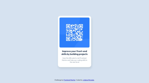
QR code solution using flexbox and basic css.

Solution retrospective
I allways strugle to structure the css file. On this challenge, I separated the page structure and the typography. What would be the best practices on how to organize the css (when we are not using scss and alike)?
Please log in to post a comment
Log in with GitHubCommunity feedback
- @grace-snow
Overall this is really good. There's just a few suggestions for improvement and one critical issue you need to fix
- The image should ideally have slightly more meaningful alt text like "QR code to FrontendMentor.io"
- It's less performant to load the css reset as a separate file
- The order of the css is very strange in this. On larger projects you definitely won't want repeating selectors in different places. Usually it's reset, base styles, fonts, then component by component
- Avoid complex css selectors or wildcard selectors unless they are absolutely necessary. Eg instead of
.qr-container > *you can place text center higher in the DOM and it would be inherited anyway. Complex css selectors increase specificity making the styles harder to manage, especially on large projects. And wildcard selectors are poor for browser performance so should be used sparingly - This is the big critical bug that is essential to change. NEVER change the font size on
:rootorhtml, and never set font size in pixels anywhere. That one line of CSS means this fails minimum accessibility standards. Read more here
Marked as helpful - @ARMoretech
A very good solution looks exactly like the sample. Good job
Join our Discord community
Join thousands of Frontend Mentor community members taking the challenges, sharing resources, helping each other, and chatting about all things front-end!
Join our Discord