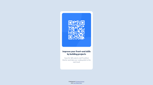
Submitted almost 3 years agoA solution to the QR code component challenge
QR code with Flexbox challenge

@stv10
Solution retrospective
Hello community! Blessings for you all, i got a question
- How can I code this better? I know there have to be a way
 @media (max-width: 1200px) {
    #card {
        width: 23%;
    }
  }

  @media (max-width: 1100px) {
    #card {
        width: 25%;
    }
  }

  @media (max-width: 1000px) {
    #card {
        width: 27%;
    }
  }
I made a lot of these querys, please if you know how can i replace them tell me And of course any other thing that colud be done better!
!UPDATE I use the max-width property, delete the querys and it worked perfect for me, also change the height property to max width, it really improved the card responsive behavior. Thx to the community for the feedback
#card {
max-width: 300px;
}
Code
Loading...
Please log in to post a comment
Log in with GitHubCommunity feedback
No feedback yet. Be the first to give feedback on stv10's solution.
Join our Discord community
Join thousands of Frontend Mentor community members taking the challenges, sharing resources, helping each other, and chatting about all things front-end!
Join our Discord