Skip to content
  • Unlock Pro
  • Log in with GitHub
Solution
Submitted over 2 years ago

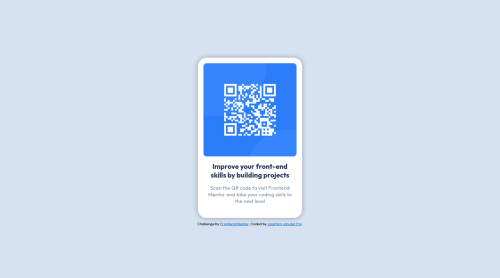
QR component challenge

Joachim van der Pol•60
@JoachimvdP
A solution to the QR code component challenge
View live sitePreview (opens in new tab)View codeCode (opens in new tab)

Solution retrospective


This is my solution to the Frontend Mentor QR component coding challenge. I initially started a junior project, but felt like it would be more appropriate to start smaller as I have very little experience.

Most of the challenge was pretty straightforward, but I struggled to get the component centered vertically. I wanted to use flexbox to do this, but I wasn't able to get it to work. Eventually I found a solution: setting the display on the body to flex, and centering it from there. In order to properly center it however, I did need to give the body a height of 100vh. It feels counterintuative to specify a height for the body. Are other solutions that are less complicated?

Code
Select a file

Please log in to post a comment

Log in with GitHub

Community feedback

  • Radasin•620
    @Radasin
    Posted over 2 years ago

    That is the simplest solution to center something in the browser viewport. The body like any other element has a height set to auto by default, so when you set it to 100vh it has the full height of the browser viewport and the flex display can then center the content in the middle. You can use position relative or absolute to place items in center, but that is more complex.

    Marked as helpful
  • Jeroen Leijnse•1,420
    @jrleijnse
    Posted over 2 years ago

    Hey there! Great job completing your first challenge! 🎊

    I have some suggestions for your code that might interest you.

    HTML 📄:

    • Instead of using the <div> tag for your containers, try using some semantic HTML to provide more meaning to it, for better SEO. For example, instead of using <div> you could use the <main> or <section> tag. For the element with the classname attribution you could use the <footer> tag.

    CSS 🎨:

    • To make your solution responsive for different devices and screen widths, you can create a media query inside your CSS file and set the breaking point (i.e. the moment your media query gets triggered based on the width of the viewport). For example: @media (max-width: 375px) { ***Place your CSS code here, just like you would in a regular CSS file***}.

    For more information on this topic, you can read the following article: Media queries 📘

    I hope you find my suggestions useful, and above all: the solution you provided is very good!

    Keep it up and happy coding! 😃

    Marked as helpful

Join our Discord community

Join thousands of Frontend Mentor community members taking the challenges, sharing resources, helping each other, and chatting about all things front-end!

Join our Discord
Frontend Mentor logo

Stay up to datewith new challenges, featured solutions, selected articles, and our latest news

Frontend Mentor

  • Unlock Pro
  • Contact us
  • FAQs
  • Become a partner

Explore

  • Learning paths
  • Challenges
  • Solutions
  • Articles

Community

  • Discord
  • Guidelines

For companies

  • Hire developers
  • Train developers
© Frontend Mentor 2019 - 2025
  • Terms
  • Cookie Policy
  • Privacy Policy
  • License

Oops! 😬

You need to be logged in before you can do that.

Log in with GitHub

Oops! 😬

You need to be logged in before you can do that.

Log in with GitHub

How does the accessibility report work?

When a solution is submitted, we use axe-core to run an automated audit of your code.

This picks out common accessibility issues like not using semantic HTML and not having proper heading hierarchies, among others.

This automated audit is fairly surface level, so we encourage to you review the project and code in more detail with accessibility best practices in mind.

How does the CSS report work?

When a solution is submitted, we use stylelint to run an automated check on the CSS code.

We've added some of our own linting rules based on recommended best practices. These rules are prefixed with frontend-mentor/ which you'll see at the top of each issue in the report.

The report will audit all CSS, SCSS and Less files in your repository.

How does the HTML validation report work?

When a solution is submitted, we use html-validate to run an automated check on the HTML code.

The report picks out common HTML issues such as not using headings within section elements and incorrect nesting of elements, among others.

Note that the report can pick up “invalid” attributes, which some frameworks automatically add to the HTML. These attributes are crucial for how the frameworks function, although they’re technically not valid HTML. As such, some projects can show up with many HTML validation errors, which are benign and are a necessary part of the framework.

How does the JavaScript validation report work?

When a solution is submitted, we use eslint to run an automated check on the JavaScript code.

The report picks out common JavaScript issues such as not using semicolons and using var instead of let or const, among others.

The report will audit all JS and JSX files in your repository. We currently do not support Typescript or other frontend frameworks.

Oops! 😬

You need to be logged in before you can do that.

Log in with GitHub

Oops! 😬

You need to be logged in before you can do that.

Log in with GitHub