Not Found
Not Found
Not Found
Not Found
Not Found
Not Found
Not Found
Not Found
Not Found
Not Found
Not Found
Not Found
Not Found
Not Found
Not Found
Not Found
Not Found
Not Found
Not Found
Not Found

Submitted

QR component solution

@Fran-Sanabria

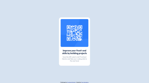
Desktop design screenshot for the QR code component coding challenge

This is a solution for...

  • HTML
  • CSS
1newbie
View challenge

Design comparison


SolutionDesign

Solution retrospective


Hello, this is my second challenge, I am still improving day by day, all the feedback received

Community feedback

PhoenixDev22 16,990

@PhoenixDev22

Posted

Hi Fran Sanabria,

Congratulation on completing this frontend mentor challenge. Your solution looks great. I have some suggestions regarding your solution:

  • You should use <main> for the card and <footer> for the attribution. HTML5 landmark elements are used to improve navigation experience on your site for users of assistive technology.
  • In my opinion, the image is an important content. The alternate text is needed on this image. The alternate text should indicate where the Qr code navigate the user : like QR code to frontend mentor not describes the image.
  • Adding rel="noopener" or rel="noreferrer" totarget="_blank"links. When you link to a page on another site using target=”_blank” attribute , you can expose your site to performance and security issues.
  • width: 320px an explicit width is not a good way to have responsive layout . Consider using max-width to the card in rem .
  • height: 497px;It's not recommended to set height to component, let the content of the component define the height.
  • Using percentages for widths, using max-width and avoiding to set heights for the components, with these things is the key to mastering responsive layouts.
  • Consider using rem and em units as they are flexible, specially for font size better to use rem. If your web content font sizes are set in absolute units, such as pixels, the user will not be able to re-size the text or control the font size based on their needs. Relative units “stretch” according to the screen size and/or user’s preferred font size, and work on a large range of devices
  • Remember a css reset on every project. That will do things like set the images to display block and make all browsers display elements the same.
  • Consider including a git ignore. Less important in this challenge but will become extremely important as you move onto larger projects with build steps

Overall, Excellent work! Hopefully this feedback helps.

1

@Fran-Sanabria

Posted

@PhoenixDev22 Thank you very much for your suggestions, I had not considered many of them and they help me a lot, I will take them into account and start applying them asap

0

@freakyjones

Posted

Hi Fran,

congratulation on completing the challenge

I just saw your code and like to give my one suggestion with your permission,

  1. Rather than using media queries throughout your CSS file you can put all your code related to that responsiveness in one place, It will be much cleaner and you have your particular device code in place.
@media screen and (min-width:950px) {
    img{
        height: 268px;
        width: 268px;
    },
    h1{
        font-size: 21px;
    }
}

I hope it helps, Thanks. Happy coding :)

0

@Fran-Sanabria

Posted

@freakyjones Thank you for your suggestion, it really helps

1

Please log in to post a comment

Log in with GitHub
Discord logo

Join our Discord community

Join thousands of Frontend Mentor community members taking the challenges, sharing resources, helping each other, and chatting about all things front-end!

Join our Discord