Please log in to post a comment
Log in with GitHubCommunity feedback
- @denielden
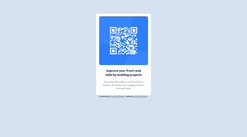
Hi Korey, good job! I took some time to look at your code and have some ideas for improving it:
- add
maintag and wrap the card for improve the Accessibility - add descriptive text in the
altattribute of the image - remove all
marginfrommainclass because with flex they are superfluous - use flexbox to the body for center the card. Read here -> best flex guide
- after, add
min-height: 100vhto body because Flexbox aligns child items to the size of the parent container - instead of using
pxtry to use relative units of measurement -> read here - instead of using
marginfor the inside space of element usepadding
Overall you did well 😉
Hope this help and happy coding!
Marked as helpful - add
- P@jeancarlosruiz
Great job!
Just a couple of feedback:
- Use a main tag to avoid accessibility issues.
- Use a footer tag in the attribution section to avoid accessibility issues.
- CSS: is better practice and set values with rem and em instead of px. Here’s a video where you can learn why https://youtu.be/N5wpD9Ov_To and a link where you can learn about rem and em https://developer.mozilla.org/en-US/docs/Web/CSS/font-size.
Happy coding! 😄
Marked as helpful
Join our Discord community
Join thousands of Frontend Mentor community members taking the challenges, sharing resources, helping each other, and chatting about all things front-end!
Join our Discord