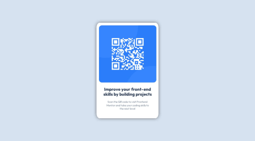
QR Component using SCSS

Solution retrospective
Questions on images
Pretty simple overall, but I was having difficulty getting the image in the spot I wanted. It kept wanting to overflow its container. The only solution I found was setting theimg {width: 97%}. Why that number? I'm not sure when I set the width to 100% the image becomes offset. If you know why this is, could you please let me know?
Update
Made changes to HTML and SCSS files. Let me know if there's any other changes I could make. Thank you For the help!
Please log in to post a comment
Log in with GitHubCommunity feedback
- @Hassiai
Replace <div class="card"> with the main tag and <h2> with <h1> to make the content/page accessible. click here for more on web-accessibility and semantic html
Every html must have <h1> to make it accessible. Always begin the heading of the html with <h1> tag wrap the sub-heading of <h1> in <h2> tag, wrap the sub-heading of <h2> in <h3> this continues until <h6>, never skip a level of a heading.
Give .qr-main a margin value for all the sides, text-align: center and a font-size of 15px which is 0.9375rem, this will be the font-size of both p and h1. Give p a margin-top or h1 a margin-bottom value for the space between the text.
For a responsive content,
- There is no need to give .card a max-height value, increase the padding value for all the sides
padding:16px which is 1rem/em - Give the img a max-width of 100% and a border-radius value, the rest are not needed.
Hope am helpful.
Well done for completing this challenge. HAPPY CODING
Marked as helpful - There is no need to give .card a max-height value, increase the padding value for all the sides
- @Shalom2935
100% didn't work because you gave your image a margin. Whatever this is a better way to make an image responsive.
- give the image a 100% width and DON'T SET ITS HEIGHT!!!
- give its container the wanted width and a height that adjust automatically (auto) in your case you should have something like this:
.qr-img { width:100%; height:auto; } .qr-img img{ width:100%; }Marked as helpful - @josh76543210
Hi @Dan-McGrath,
Removing the
margin: 0.4rem;on the image should do the trick. When the image haswidth: 100%;, the margin is not needed. Thewidth: 97%;was working because the margin was offsetting it.Hope this helps.


Join our Discord community
Join thousands of Frontend Mentor community members taking the challenges, sharing resources, helping each other, and chatting about all things front-end!
Join our Discord