QR HTML and CSS only :)

Solution retrospective
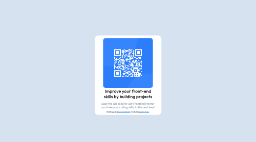
I'm having difficulties with sizing the white box. i dont know exactly what height it should have.. because in the picture you guys provide it seems a bit longer... more a rectangular form, and mine is more squarish
Please log in to post a comment
Log in with GitHubCommunity feedback
- @thedoodlebakery
It looks good. Try playing around with your padding for the white box. Probably adding more padding to the top and bottom vs the left and right. Start someone where with something like padding: 10px 15px; The first number in that style is the top and bottom and the second number applies to the left and right.
Marked as helpful - @AndyAshley
I agree with what Paula said. It looks really good. The padding is most likely the issue going on. you can wrap the text in a div and give it some padding on the left and right. You could do something like:
padding-inline: 15px;
you can check my code to see how I dealt with the layout. Mine isn't as tall either.
Marked as helpful - @Samadeen
Hey!! Cheers 🥂 on completing this challenge.. . Here are my suggestions 1.You should use <main class="white-bg"> instead of <div class="white-bg">. 2. Go down orderly when you are using the headings h1 down to h2 down to h3 and so on. 3. You should maybe reduce the padding on both left and right of your card
. Regardless you did amazing.. Happy coding!!!
Marked as helpful


Join our Discord community
Join thousands of Frontend Mentor community members taking the challenges, sharing resources, helping each other, and chatting about all things front-end!
Join our Discord