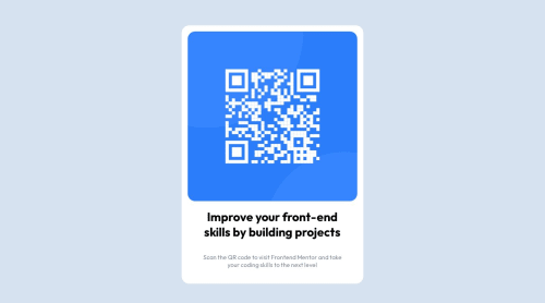
Submitted almost 2 years agoA solution to the QR code component challenge
QR-Code Card Using Flexbox

@Alfrey-Chan
Solution retrospective
CSS Styling
- I wanted to decrease the height of the card to make it more centered, would setting a max-height % for my card div be the correct approach?
- I selected font weights 400 and 700 for the google font, how does it decide which elements will use those weights? (Seemed like my h1 and p tags automatically took the weights 700 and 400 respectively)
- I originally wanted to wrap my h1 and p tag into a <div class="text">, would that be unnecessary?
Code Organization and Practices
- Are there any bad practices that are worth mentioning?
- Is there anything I can do to improve readability?
Code
Please log in to post a comment
Log in with GitHubCommunity feedback
- @Freedteck
Hello, I can't find fault in ur html code, where you probably need changes is in your css code. Below are the suggestions I have:
- Since u used the flexbox property on ur body tag, use the
flex-direction: column;. This will make ur card at the center of the page. - For the font weight, it's best to apply corresponding weight to individual element such as
h1 {font-weight: 700;}andp {font-weight: 400;} - The flexbox has a gap property which you can apply to the
card-contentsto give space btw the components inside. Such asgap: 20px;
Marked as helpful - Since u used the flexbox property on ur body tag, use the

Join our Discord community
Join thousands of Frontend Mentor community members taking the challenges, sharing resources, helping each other, and chatting about all things front-end!
Join our Discord