Please log in to post a comment
Log in with GitHubCommunity feedback
- @ylin320
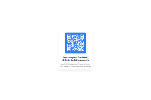
What I liked: You added a shadow to the container, which gives it a nice depth effect!
Possible improvements: Background color: The page background doesn't match the design. Updating it to #d5e1ef will make it closer to the original. Container & QR code sizes: The dimensions of the main container and the QR code container differ from the design. Checking the Figma file and adjusting the width/height might help. Responsiveness: Make sure the layout scales properly on different screen sizes. Testing with DevTools can be useful!
Overall, this is a solid attempt, and with a few tweaks, it will look even better! Keep up the great work!
Join our Discord community
Join thousands of Frontend Mentor community members taking the challenges, sharing resources, helping each other, and chatting about all things front-end!
Join our Discord