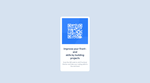
Qr-code-component using HTML and CSS

Solution retrospective
This is my first warm-up challenge. I'm pretty sure I shouldn't use <br /> but I hadn`t other idea. Thank you for your attention and thank you in advance for your feedback
Please log in to post a comment
Log in with GitHubCommunity feedback
- @MelvinAguilar
Hello there 👋. Good job on completing the challenge !
I have some suggestions about your code that might interest you.
HTML 🏷️:
-
The <br> tag is often used to create line breaks, but it doesn't convey any semantic meaning. When a screen-reader reads the text, it will break the flow of reading at the line break tag, which can be confusing for users.
Use
max-widthon the paragraph to give it the desired shape and usemarginto center it.
- Wrap the page's whole main content in the
<main>tag.
CSS 🎨:
- Instead of using pixels in font-size, use relative units like
emorrem. The font-size in absolute units like pixels does not scale with the user's browser settings. Resource 📘.
- Setting the width of the component with a percentage or a viewport unit will behave strangely on mobile devices or large screens. You should use a max-width of
320pxor20remto make sure that the component will have a maximum width of320pxon any device, also remove thewidthproperty with a percentage value.
I hope you find it useful! 😄 Above all, the solution you submitted is great!
Happy coding!
Marked as helpful -

Join our Discord community
Join thousands of Frontend Mentor community members taking the challenges, sharing resources, helping each other, and chatting about all things front-end!
Join our Discord