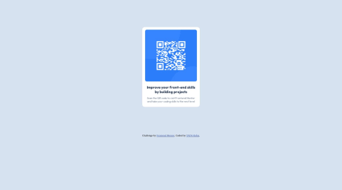
QR-code-component ussing css and html

Solution retrospective
Completed my first Frontend Mentor challenge.I'm having trouble adapting my website to different screen sizes like mobile devices. It currently looks great only on my laptop. Any advice or recommendations for free courses to help me learn how to make it responsive?
Please log in to post a comment
Log in with GitHubCommunity feedback
- P@atif-dev
Hi, congrats on completing the challenge. Better take care about following points:
- A simple way to center the container is using flex or grid. For better look modify
.containeras:
.container {
background-color: hsl(0, 0%, 100%);
margin-bottom: 8%;
width: 225px;
height: 325px;
border-radius: 10px;
padding-top: 11px;
}
and use following code as:
body { display: grid; place-content: center; min-height: 100vh; }- You must be seeing some accessibility issues after submission the project. To avoid such issues use semantic tags and apply following structure:
<body> <main> ---your code here---- </main> <footer> </footer> </body>- It is preferred to use responsive units.(
remfor font-size andemfor margin and padding). - Write more in README file of Github project. Like write about your working flow, findings, newly learned things, useful resources, etc.
- Since you are not familiar with responsiveness as you said in comment to have issues for different screen sizes...so in that case I will suggest you this free intro course for responsiveness. Link of course
Hope you will find this Feedback Helpful.
Marked as helpful - A simple way to center the container is using flex or grid. For better look modify
- P@jgreen721
Nice work, and congrats on finishing your first challenge! I see you used
%as your width units which, you may want to be careful with since that will respond to the relativity of your devices screen width and so can shrink/grow to undesired sizes. There are a bunch of ways to change it but one way could be to just set amin-width:#pxin there.remandemunits also available (and are generally preferred over pixels as again, they handle screen-resizing a bit better). All these things have plenty of information on them so not a big deal to digest all that, main suggestion would in just be setting the min-width. Again, nice work and congrats! 😎Marked as helpful


Join our Discord community
Join thousands of Frontend Mentor community members taking the challenges, sharing resources, helping each other, and chatting about all things front-end!
Join our Discord