


@correlucas
Posted
👾Hello Nassin, congratulations for your solution!
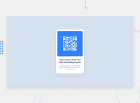
Your solution code is perfect, but the component isn't fully responsive, because you've set two properties to manage the width inside the card class. Here's the code you should delete to allow the max-width works better:
.card {
    margin: auto auto;
    /* width: 80%; */
    max-width: 18rem;}
See that after deleting the widthand letting max-width you container will works perfectly.
Hope it helps and happy coding!
Marked as helpful
@Nassim555
Posted
@correlucas The reason I added the rule width:80%; is to prevent the card from sticking to the side on smaller screen sizes note that I can't use margin for this same purpose since it would interfere with the margin:auto; rule so I took that approach instead in order for the card to take only 80% of the width of the body and then use max-width:18rem; so it won't exceed the 18 rem on bigger screen sizes , but I don't get what do u mean by not being fully responsive I've just tested it and it adapts the viewport just fine , anyway thanks for your feedback I appreciate it.
@correlucas
Posted
@Nassim555 that's okay, I was just trying to help bro 😭
@Nassim555
Posted
@correlucas I understand I didn't say anything that underappreciate your help or disrespect you I was just trying to explain why I took that approach, sorry if the language style I used looked somehow offensive, your help is appreciated and your feedbacks are more than welcomed so keep them coming bro 🙏.

