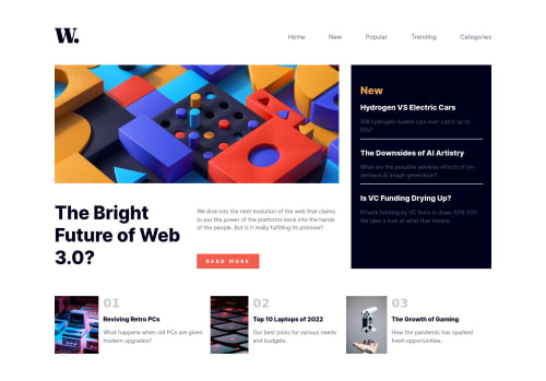
Not Found
Not Found
Not Found
Not Found
Not Found
Not Found
Not Found
Not Found
Not Found
Not Found
Not Found
Not Found
Not Found
Not Found
Not Found
Not Found
Not Found
Not Found
Not Found
Not Found

Submitted

React in TypeScript and Responsive design with CSS

#bem#react#sass/scss

@kaixuan98

Desktop design screenshot for the News homepage coding challenge

This is a solution for...

  • HTML
  • CSS
  • JS
2junior
View challenge

Design comparison


SolutionDesign

Solution retrospective


I have been working on web development for quite a while. I wanted to improve in depth where focus on best practices. Do you have any questions about best practices? Which areas of the code that you find it unsure of or violating the best practices? Which area that you think is okay but can be improved with XYZ change?

Community feedback

@maximusDecimalusMeridius

Posted

Hi there, great job the site looks awesome! Regarding your question, I might suggest use of semantic HTML tags as a best practice for accessibility and screen readers. I also noticed that the navmenu and hero banner seem to get smushed unintentionally when resizing down to 600px. It may be worth reviewing how your flex items flow in the document.

All that said, keep up the great work and good luck on your next challenge!!

Marked as helpful

1

@kaixuan98

Posted

@maximusDecimalusMeridius Thank you for the comment! I look into semantic HTML, it opens up the rabbit hole to accessibility and got me started to thinking about accessibility. I had implemented semantic HTML and some basic accessibility practise with ARIA.

I also went in to fix the sizing issues, where at 600px point, the nav bar switched to the mobile version but does not show the overlay nav bar.

0

Please log in to post a comment

Log in with GitHub
Discord logo

Join our Discord community

Join thousands of Frontend Mentor community members taking the challenges, sharing resources, helping each other, and chatting about all things front-end!

Join our Discord