React JS and Style Components

Solution retrospective
Hey fellow developers, please review and give feedback. Thank you in advance.
Please log in to post a comment
Log in with GitHubCommunity feedback
- @AlexKMarshall
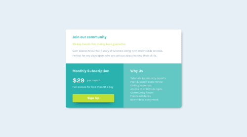
Looks good on desktop, it's laid out nicely. It could do with some work on mobile though, the spacing is off, you're missing a lot of padding.
Edit: I see you've fixed the mobile spacing since I wrote this, so that's looking better now.
I'd avoid using margin for spacing now. Flex gap is supported in all major browsers and is a more robust choice for laying out each of the component sections.
You've got some specified widths in there, like 90%. I would again avoid that. Flex alignment and padding on the container should get you everything you need.
For my personal taste there's too many separate components that makes the project hard to navigate. I would move the styled components into the same file as the component that they're styling, it makes it a lot easier to see what depends on what. I would try and reduce the number of wrapping divs here too. You can have one element for the main grid container. 3 elements inside that - one for each section, and then the content directly inside those.
I'd probably do it all in one React Component too, there's no functionality here that makes separating out into multiple components worth-while, this reference is good: https://kentcdodds.com/blog/when-to-break-up-a-component-into-multiple-components
Marked as helpful - @mdajmalshadab
Hey, nice work, everything is fine except the fact that the card is jumping a bit while changing the screen size and try increasing the length of the button shadow and add hovering color change on the button if possible. Happy Coding!
Marked as helpful


Join our Discord community
Join thousands of Frontend Mentor community members taking the challenges, sharing resources, helping each other, and chatting about all things front-end!
Join our Discord