Reactjs, React hooks

Solution retrospective
Nothing to really ask, just test and your feedback plz
Please log in to post a comment
Log in with GitHubCommunity feedback
- @pikapikamart
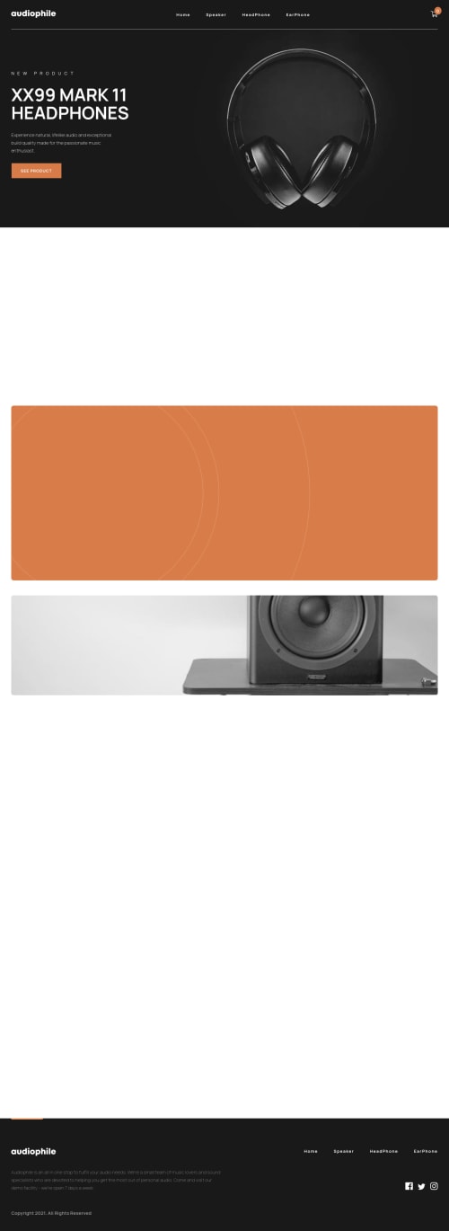
Hey, awesome work on this guru challenge. The website feels really nice and the animations are good. Layout on desktop and mobile seems good as well. Though I would recommend a bit more padding to the left and right sides just to limit.
Some suggestions would be:
- Have a
maintag that wraps the content of your website. Always have this landmark so that other users could properly navigate and make sense of a website. - navbar should have been wrapped inside the
headerelement - the "audiophile" link on the navbar should have a
aria-label="homepage"this way, it will be more accessible and screen readers users know where this links is supposed to go. - lose the words "logo" "icons" when using an
imgelement or ansvgbecause assistive tech will handle those that is why you don't need them. - the navbar links could have used a structure like:
<nav>
  <ul>
    <li>
       <a> your link in here</a>
    </li>
  </ul>
</nav>
on the
atags on your navbar, you should have usedaria-currentattribute. This will announce where is the users when navigating in another page on your website.- your
.mobileNavLinkssection element that you are using when it is for mobile state should be hidden usingdisplay: noneorvisiblity: hidden. If you try to use keyboard on your homepage, you will see that it is navigating you to a hidden link, which in your case, the link for the mobile layout. You need to replace those one. - Your "cart" on the navbar should have used a
buttonelement to make it accessible, along witharia-expandedattribute. - Your "card" dropdown should have a for example, exit
button. Because if you for example open the dropdown, there is no way to exit that dropdown if you are using keyboard, and other users that uses different assistive tech will also have no way to exit. The dropdown as well could have beenasideelement. - "new product" text in the hero-section should not have used heading tag. If you included a
mainelement on your website, instead of the headphone text being read, it will read "new product" which is not really useful at all. Consider it usingptags. - Avoid using multiple
h1on a page. Use only 1h1per page. - the "ZXY" headphone section in the homepage, you don't need to nest the
buttoninsideatag. Use theatag alone. Also, you may have noticed, try hovering on thex-asisof the link, even if I hover not direct to it, it is triggering it. It is an effect from the flexbox parent. Addalign-items: flex-starton thesectionelement that is nesting them. - Also, some others as well, nesting
buttoninatag. Treat theaitself only. - "Audiophile" logo link on
footeras well should have been usingaria-label - social media links in the
footersection should have usearia-labelto know what social media link it is. Ex:aria-label="facebook"then use aaria-hiddenon thesvgthat is holding the social media icons. - The
buttonelements on the product information, the ones that you used to add or subtract the quantity of product that you are using, those should have usedaria-label. For example, on thebuttonthat minus:
<button aria-label="remove 1 item"> or other descriptive text for subtracting
-
</button>
The parent of this could have used a
sr-onlytext that says what is this section about. Like:<div class="visually-hidden">Make choice on how many you want to buy</div>something like that or other text that makes sense.- Addition to that, using a
aria-live="polite"to announce how many that the user have added from that item. This will be really beneficial.
On the mobile state:
- The hamburger menu should have used
buttonelement along witharia-expandedattribute. - The paddings also could have been adjusted. The layout are almost on the edges of the screen.
- The dropdown for the mobile state should have been using
display: nonewhen the user is not toggling the dropdown. Try to use keyboard again on this one, it will navigate you to a hidden link. Do not just transitionopacityor other things, when you want to make an interactive element to appear. On this one, the links should totally be hidden until the hamburger is triggered.
I haven't checked your react but hey, react is opinionated. It may be a lot, but structuring html is way more important than creating beautiful websites. This one is really good, but you need to make used of more appropriate elements and maybe more into accessibility to provide to more users.
But still, you did a really good job on this one. This one is hard to do!!
Marked as helpful - Have a
Join our Discord community
Join thousands of Frontend Mentor community members taking the challenges, sharing resources, helping each other, and chatting about all things front-end!
Join our Discord