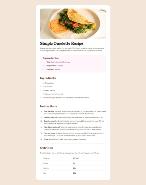
Receipt Card with CSS flex and grid

Solution retrospective
Wow - this was deceptively difficult! A well-planned crash course in working through details.
I really enjoyed the HTML stage, trying to foresight what CSS selecting I would need. It was rewarding to minimize the refactoring.
I enjoyed learning about the element for the elegant section dividers. It took some Googling to understand the border and color properties, but I found the options intuitive.
Most of all it was great to work with a grid for the nutrition section. I've long found grids intimidating. But simply getting the content in the right cells, and then gradually applying each style, I really surprised myself. Especially applying nth-of logic, ie. no bottom border for last two elements, odd divs are left-margin, even divs are brown and strong etc. seemed really easy and intuitive.
What challenges did you encounter, and how did you overcome them?I spent most of the project time fighting with list bullet points. The standard list properties were simple to work with, and the ::marker pseudo allowed me to color and indent with detail. It was all smooth-sailing - until - the sneaky bullet point being vertically center-aligned over multi-line threw everything out the window.
I went back-and-forth between trying ::marker and ::before properties. A lot of the advice I found gave poor-practice solutions with mixed results, and nothing centered the bullet point. Eventually a Stack Exchange solution explicitly said ::marker simply can't vertical align. Certainty at last! I then committed to ::before, and found an example to flex and vertically center each for the win.
The last hurdle was the ordered list numbers reverting to system font, which stood out different to the design. I tried selecting every element involved, and even used inspect to go through all the property inheritances, but it was telling me different to what I was seeing. Again, Stack Exchange rescued by explicitly saying ::marker does not take font-family, but rather only the shorthand font property. A detailed read through the property syntax, and I was able to get it looking close to design.
I was really proud of myself for working through these details, when a lot of problem-solving seemed to be "it depends". With enough persistance I think I found the best solution to the list problems.
What specific areas of your project would you like help with?I'm not really sure if I used semantic elements all that well for this project. I read the W3 descriptions, but struggled to interpret how to apply them to a recipe context. At times I was as semantic as possible just to fulfill the brief, but not certain if my usage has any real-world benefits.
Please log in to post a comment
Log in with GitHubCommunity feedback
No feedback yet. Be the first to give feedback on tris6’s solution.
Join our Discord community
Join thousands of Frontend Mentor community members taking the challenges, sharing resources, helping each other, and chatting about all things front-end!
Join our Discord