Solution retrospective
I'm really proud I pushed through to make things as exact as I could, while still keeping the site very responsive.
I think I really want to make my code much cleaner to read. I also would like to post this on our Discord community so I can get more input from other professionals on what I could have done differently.
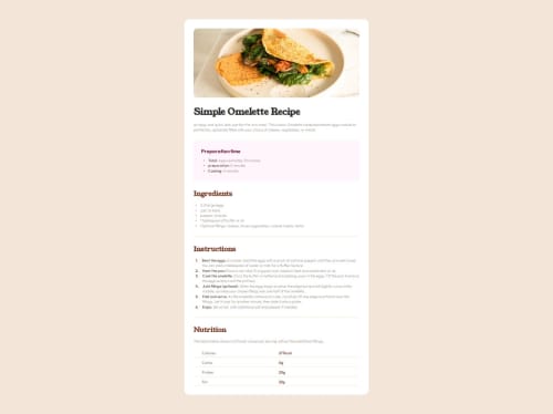
What challenges did you encounter, and how did you overcome them?I ran into an issue with adding a gap at the top and bottom of the page. when I center the content using flex or grid it will automatically add a gap at the top and bottom if there is space. However b/c the content is long I had to make sure based on a certain height add a gap automatically, and still allow the content to take more space than what is made available by the parent.
I also had an issue with adding space between the marker and content in the li element. I essentially had to hide the marker, use another notation to get the bullet points or numbers as an additional item in the flex li container. This gave me more styling flexibility.
Honestly i don't know what my life would be like without Grid or flex.
What specific areas of your project would you like help with?I would like someone to review my code and give me feedback on how to make it easier to read, and also what principals or techniques I could have used to have less code if possible.
Please log in to post a comment
Log in with GitHubCommunity feedback
No feedback yet. Be the first to give feedback on jardellprod's solution.
Join our Discord community
Join thousands of Frontend Mentor community members taking the challenges, sharing resources, helping each other, and chatting about all things front-end!
Join our Discord