Skip to content
  • Unlock Pro
  • Log in with GitHub
Solution
Submitted 7 months ago

Recipe Page - HTML - CSS

Gigantisk•40
@Gigantisk
A solution to the Recipe page challenge
View live sitePreview (opens in new tab)View codeCode (opens in new tab)

Solution retrospective


What are you most proud of, and what would you do differently next time?

Most of the page.

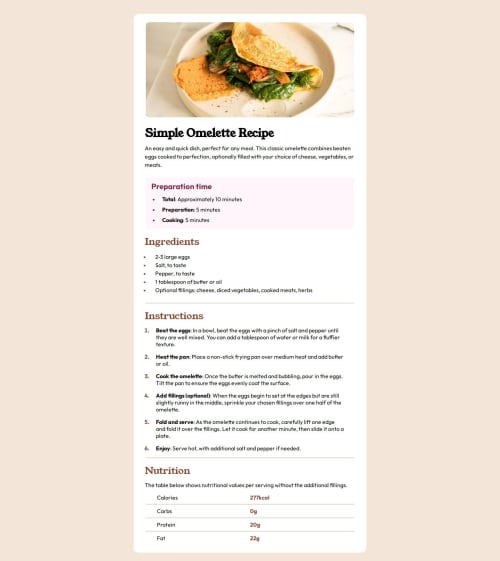
What challenges did you encounter, and how did you overcome them?

Create a table and separate line.

Research how to do it on internet.

What specific areas of your project would you like help with?

Some advice for better accessibility on different device, or any other advice for table.

Code
Select a file

Please log in to post a comment

Log in with GitHub

Community feedback

  • Irina Lagutina•640
    @FoxMalder-coder
    Posted 7 months ago
    1. There is a easier way to deal with rem. a) your need set font: size: 62.5% to html --- rem will be 10px; b) set initial (if so) value to body font-size: 1.6rem --- 16px for text-elements and then c) use any rem values inside your's css --- like 240px is 24rem - no hard calculation)))
    2. To make adaptive layout use max-width instead of width (image, table and container). Also don't forget to make images display: block
    Marked as helpful
  • hitmorecode•7,540
    @hitmorecode
    Posted 7 months ago

    Congratulations well done. I do have some pointers

    • It's best to have a CSS reset on a page, this is a simple CSS reset.
    * {
       margin: 0;
       padding: 0;
       box-sizing: border-box;
    }
    
    • You can remove the margin: 0; on the body.
    .container {
        width: var(--670px);
        background-color: white;
        border-radius: 15px;
        margin-top: 60px;
        margin-left: auto;  // you can remove this
        margin-right: auto; // you can remove this
        padding-bottom: 24px; // change this to just al-round padding
    }
    

    The reason why your page is not responsive is, because you are not using media queries. If you had media queries, you can adjust the page for all different screen sizes.

    • They way you setup the root it's not clear what it is. It might be clear for you for now, but for someone else it's not clear what it is. Give your variables names that make sense.
    :root {
        --16px: 1rem;
        --22px: 1.375rem;
        --32px: 2rem;
        --575px: 35.9375rem;
        --600px: 37.5rem;
        --670px: 41.875rem;
    }
    
    :root {
       --font-size-16: 1rem;
       --font-size-22: 1.375rem;
       --font-size-32: 2rem;
       --width-container-575: 35.9375rem;
       // and so on with this is easier to understand what you are doing
    }
    
    • You didn't add the font style on your page, right now it's using the default font style.

    See if you can fix the responsiveness with media queries. If you need help let me know. I hope you find this helpful.

    Keep it up 👍👌

    Marked as helpful
  • Olaniyi-Fatola•70
    @Olaniyi-Fatola
    Posted 7 months ago

    This is absolutely great. For accessibility on different devices, you can use media queries which is "@media (max-width: 768px){}" and then code the what you'll like be different for mobile devices on it. You can check out this video on youtube for better understanding https://youtu.be/k0UVMuCXJtY?si=Y56Xin_U6RjFGdOG

    Marked as helpful

Join our Discord community

Join thousands of Frontend Mentor community members taking the challenges, sharing resources, helping each other, and chatting about all things front-end!

Join our Discord
Frontend Mentor logo

Stay up to datewith new challenges, featured solutions, selected articles, and our latest news

Frontend Mentor

  • Unlock Pro
  • Contact us
  • FAQs
  • Become a partner

Explore

  • Learning paths
  • Challenges
  • Solutions
  • Articles

Community

  • Discord
  • Guidelines

For companies

  • Hire developers
  • Train developers
© Frontend Mentor 2019 - 2025
  • Terms
  • Cookie Policy
  • Privacy Policy
  • License

Oops! 😬

You need to be logged in before you can do that.

Log in with GitHub

Oops! 😬

You need to be logged in before you can do that.

Log in with GitHub

How does the accessibility report work?

When a solution is submitted, we use axe-core to run an automated audit of your code.

This picks out common accessibility issues like not using semantic HTML and not having proper heading hierarchies, among others.

This automated audit is fairly surface level, so we encourage to you review the project and code in more detail with accessibility best practices in mind.

How does the CSS report work?

When a solution is submitted, we use stylelint to run an automated check on the CSS code.

We've added some of our own linting rules based on recommended best practices. These rules are prefixed with frontend-mentor/ which you'll see at the top of each issue in the report.

The report will audit all CSS, SCSS and Less files in your repository.

How does the HTML validation report work?

When a solution is submitted, we use html-validate to run an automated check on the HTML code.

The report picks out common HTML issues such as not using headings within section elements and incorrect nesting of elements, among others.

Note that the report can pick up “invalid” attributes, which some frameworks automatically add to the HTML. These attributes are crucial for how the frameworks function, although they’re technically not valid HTML. As such, some projects can show up with many HTML validation errors, which are benign and are a necessary part of the framework.

How does the JavaScript validation report work?

When a solution is submitted, we use eslint to run an automated check on the JavaScript code.

The report picks out common JavaScript issues such as not using semicolons and using var instead of let or const, among others.

The report will audit all JS and JSX files in your repository. We currently do not support Typescript or other frontend frameworks.

Oops! 😬

You need to be logged in before you can do that.

Log in with GitHub

Oops! 😬

You need to be logged in before you can do that.

Log in with GitHub

Oops! 😬

You need to be logged in before you can do that.

Log in with GitHub