
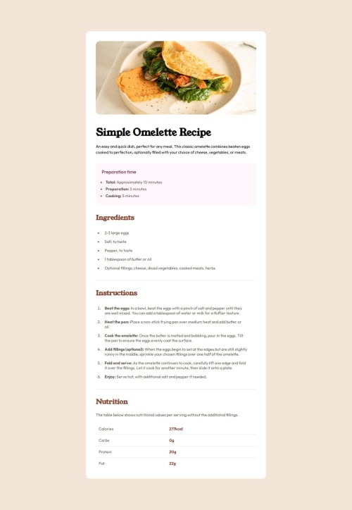
Solution retrospective
What are you most proud of, and what would you do differently next time?
The progress I have made on the structure of the html alongside the use of class names trying to adhere to BEM standards. Also using variables in css which allows for better uniformity and ease of use.
What challenges did you encounter, and how did you overcome them?The image needed 100% width on the mobile version. However the padding in the pareent element was stopping this from happening.
To adapt to this I made an div that encompassed the other elements and gave that apdding. while using media queries to fix the other parts.
Any feedback is welcome!
Code
Loading...
Please log in to post a comment
Log in with GitHubCommunity feedback
No feedback yet. Be the first to give feedback on Kumani Kidd's solution.
Join our Discord community
Join thousands of Frontend Mentor community members taking the challenges, sharing resources, helping each other, and chatting about all things front-end!
Join our Discord