
Please log in to post a comment
Log in with GitHubCommunity feedback
- @jdrodriguez2707
Hi, @sanjv12. I hope you're doing great.
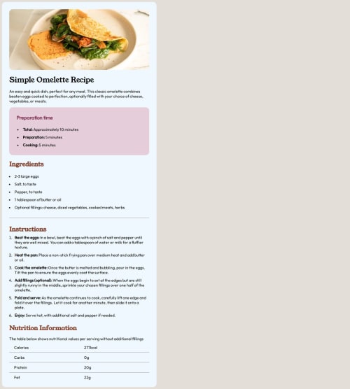
First of all, your solution is good. You copied the structure and the styles of the design well. But there are some details you should check out to improve the solution. For example the container size, which looks stretch when the screen resizes. To solve this, you could remove the
width: 40vwso the container can resize according to the screen size. Also, remember to set a max-width (like max-width: 750px) so the container doesn't grow more than necessary and looks more similar to the desktop design.On the other hand, you can do the same thing with the recipe image. You just need to remove the height property and the image will resize according to the container size. Lastly, don't forget to choose the right colors (you can find them in the style-guide.md file) but if you feel more comfortable with your own color palette, it's okay.
That's it. I hope this help you. Best of luck!

Join our Discord community
Join thousands of Frontend Mentor community members taking the challenges, sharing resources, helping each other, and chatting about all things front-end!
Join our Discord