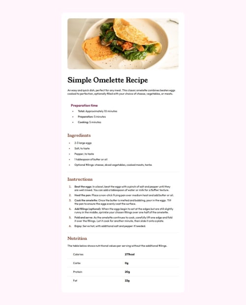
Submitted about 2 years agoA solution to the Recipe page challenge
Recipe page using HTML and CSS
LVL 1

@itsjavascript
Solution retrospective
- What are the best practices and advice for properly writing and using media queries in CSS?
- When styling for different breakpoints, I noticed discrepancies between the design displayed at a specific viewport size within browser developer tools (e.g., 320px) and the layout when resizing the browser manually. Which should I prioritize to ensure responsiveness? Additionally, do you have any tips for effectively evaluating website responsiveness within browser developer tools while also manually resizing the browser window?
Code
Loading...
Please log in to post a comment
Log in with GitHubCommunity feedback
No feedback yet. Be the first to give feedback on Boneless_egg’s solution.
Join our Discord community
Join thousands of Frontend Mentor community members taking the challenges, sharing resources, helping each other, and chatting about all things front-end!
Join our Discord