Recipe Page using HTML & CSS

Solution retrospective
I think I got the design close, but my biggest personal goal was to have clean, simplified semantic HTML and CSS—as little as I could get away with to accomplish what I needed.
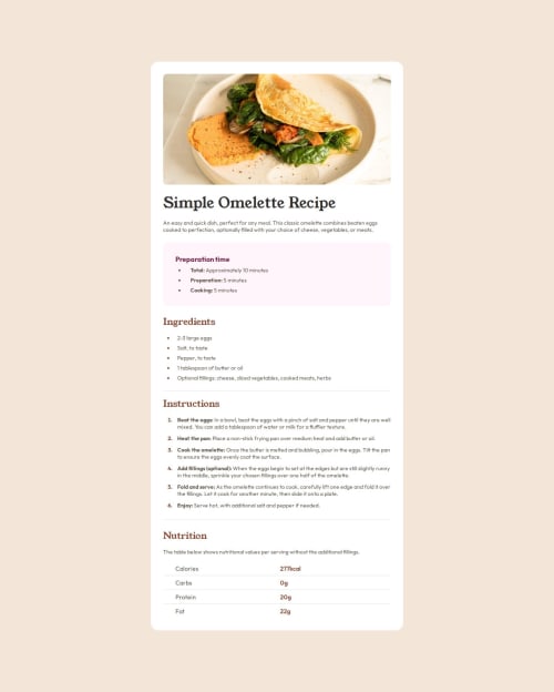
What challenges did you encounter, and how did you overcome them?Due to my choosing to add padding on the `` container, I had a hard time getting the header image to fill the width of the screen on mobile. My workaround for this was to use negative margins and calc width to force overflow, but I believe there is a cleaner solution to this. It works, it's just not pretty on the backend.
main img {
    width: calc(100% + 3rem);
    height: 10rem;
    object-fit: cover;
    border-radius: 0;
    margin: -1.5rem -1.5rem 0 -1.5rem;
  }
Also, a minor problem: in the Instructions section, the 1 marker has a serif character instead of sans-serif like the design, even though I believe it's the same font. I even tried overriding the font just to be sure. I'm not sure if that's something I did wrong or if it's just a small error with the image file provided.
What specific areas of your project would you like help with?Ensuring correct HTML tags were used and if there's a suggestion on how to handle my issue with the header graphic better.
Please log in to post a comment
Log in with GitHubCommunity feedback
- @Alex-Archer-I
Hi!
You are doing great with semantic tags! Better than me - I was in rush with this challenge and totally forgot about
ollist =)The only thing is the headers. I think that "ingredients", "instructions" and "nutrition" are headers of the same level and they all can be a
h2orh3. The headers hierarchy has a tree structure. For example, the page has oneh1and multiple articles which haveh2headers. Than the articles could have a sections with ah3etc. Sure, it's a spherical cow in a vacuum example, real projects are often more tricky.About the image... well I noticed too late that in the mobile version it has a full screen width, so I just separated it from the other content and used the same paddings. I don't like it, honestly. Your solution seems more elegant =)
P.S. Yep, I thought the first marker in the instructions has different font too. But I guess it's just an oversight.
Marked as helpful - @SergioBrandaoF
Not bad, but the dimensions of your solution site don't match the provided design.


Join our Discord community
Join thousands of Frontend Mentor community members taking the challenges, sharing resources, helping each other, and chatting about all things front-end!
Join our Discord