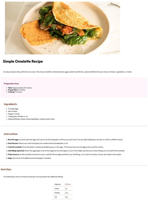
Recipe page using HTML and CSS

Solution retrospective
I'm proud that I was able to get through the project, I just wish I could of matched the design better.
What challenges did you encounter, and how did you overcome them?I'm in the beginner stages on learning how to code so I struggled with the CSS part and didn't overcome them because I was not sure on proper steps.
What specific areas of your project would you like help with?I only did the mobile but please give me feedback so I can improve. 1. Why didn't the image take up the full width of the page when I had it set to max-width:100% and display: block? 2. Why couldn't I get the rose color background to look like the design? 3. Why couldn't I get any of the text to move to look similar to the design. Such as I couldn't get the paragraph() text to move closer to the heading () like the design and Why couldn't I get the heading "Instructions" to move up. 4.. Why is there a break in the line in the table for nutrition? Please help me understand how to improve.
Please log in to post a comment
Log in with GitHubCommunity feedback
No feedback yet. Be the first to give feedback on Araya’s solution.
Join our Discord community
Join thousands of Frontend Mentor community members taking the challenges, sharing resources, helping each other, and chatting about all things front-end!
Join our Discord