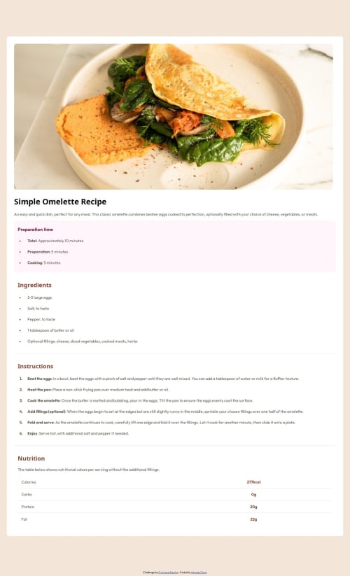
Recipe Webpage Built Using HTML + CSS

Solution retrospective
I'm most proud of the table formatting for this project. It was one of the most challenging parts of this project for me and learning how to structure and style the component was quite rewarding especially once I figured it out. I think for future projects, I want to take more notes on my process as well as figuring out ways to best structure my code, so that it's as efficient and effective as possible.
What challenges did you encounter, and how did you overcome them?A major challenge I faced was figuring out how to change the colors of the markers for the list items and how to position them so that they weren't so close to the text. That took quite a bit of looking over the web.dev pages and googling for additional resources. I also did some experimentation by playing around with the values until I was satisfied with the spacing.
What specific areas of your project would you like help with?I spent quite a lot of time trying to figure out how to reposition the container after I resized the window, but I wasn't able to figure out how to do it properly. When you resize the window, the recipe page is responsize (so it is readjusted to fit the screen), but there are still margins at the top and bottom that exist that I wasn't able to figure out how to remove. I was using the @media screen query to help me with it, and so it's half working, but not exactly what I want.
Please log in to post a comment
Log in with GitHubCommunity feedback
No feedback yet. Be the first to give feedback on maggiechua's solution.
Join our Discord community
Join thousands of Frontend Mentor community members taking the challenges, sharing resources, helping each other, and chatting about all things front-end!
Join our Discord