Skip to content
  • Unlock Pro
  • Log in with GitHub
Solution
Submitted about 1 month ago

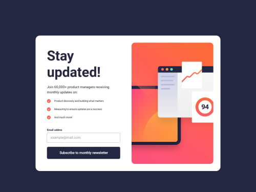
Reponsive layout using grid, tailwind md

react, tailwind-css
Mori•170
@MoriNo23
A solution to the Newsletter sign-up form with success message challenge
View live sitePreview (opens in new tab)View codeCode (opens in new tab)

Solution retrospective


What are you most proud of, and what would you do differently next time?
  1. Proper Use of min-height in Layouts

"How can I use min-height effectively to prevent layout issues? I learned it’s useful for ensuring a container doesn’t shrink too much, but I’m unsure how to balance it with other properties (like height or flex-grow) to avoid unexpected expansion."

Key points:

You recognize its importance for responsive containers.

You want to avoid conflicts with other layout rules.

You’re seeking practical examples (e.g., min-height in Flexbox/Grid).
What challenges did you encounter, and how did you overcome them?

Optional: Code Structure Feedback

"Are there ways to simplify my form validation logic or CSS structure? I’d appreciate feedback on making my code more maintainable."

Key points:

Open-ended request for optimization.

Targets readability/scalability.
Code
Select a file

Please log in to post a comment

Log in with GitHub

Community feedback

  • P
    BlonoBuccellati•310
    @BlonoBuccellati
    Posted about 1 month ago

    I’d like to share a few thoughts.

    About height and min-height

    I generally avoid using height in layouts, and instead rely on max-width, padding, and flow-based layouts. Setting a fixed height can easily cause content to overflow or become clipped, especially on smaller screen sizes.

    As you mentioned, min-height is useful when you want to ensure a container keeps a minimum size — such as for modals. In this specific UI, I would use min-height for the modal buttons on mobile view, to ensure they are always placed near the bottom of the viewport. For that, I use min-h-screen in Tailwind CSS, which is equivalent to min-height: 100vh.


    About the structure

    It seems the GitHub repository only includes the compiled source code, so unfortunately I wasn’t able to review the layout structure itself.


    On form validation logic

    I recommend using custom hooks to isolate form logic, such as validation, input state, and submission handling. This improves readability and reusability — especially as your forms become more complex.


    On simplifying CSS

    There are a few key principles I follow to keep CSS maintainable:

    1. Mobile-first design: Start by designing for the smallest screen first. It often leads to simpler layout logic. I recommend this article:
      How to Take the Right Approach to Responsive Web Design

    2. Typography tokens: I like managing typography using tokens or utilities. Here's an example using Tailwind v4:

      @utility typo-header {
        font-family: var(--font-roboto);
        font-weight: var(--font-weight-bold);
        font-size: clamp(2.5rem, 1.556rem + 4.05vw, 3.5rem);
        line-height: 100%;
        letter-spacing: 0;
      }
      

    Hope this helps!

    Marked as helpful

Join our Discord community

Join thousands of Frontend Mentor community members taking the challenges, sharing resources, helping each other, and chatting about all things front-end!

Join our Discord
Frontend Mentor logo

Stay up to datewith new challenges, featured solutions, selected articles, and our latest news

Frontend Mentor

  • Unlock Pro
  • Contact us
  • FAQs
  • Become a partner

Explore

  • Learning paths
  • Challenges
  • Solutions
  • Articles

Community

  • Discord
  • Guidelines

For companies

  • Hire developers
  • Train developers
© Frontend Mentor 2019 - 2025
  • Terms
  • Cookie Policy
  • Privacy Policy
  • License

Oops! 😬

You need to be logged in before you can do that.

Log in with GitHub

Oops! 😬

You need to be logged in before you can do that.

Log in with GitHub

How does the accessibility report work?

When a solution is submitted, we use axe-core to run an automated audit of your code.

This picks out common accessibility issues like not using semantic HTML and not having proper heading hierarchies, among others.

This automated audit is fairly surface level, so we encourage to you review the project and code in more detail with accessibility best practices in mind.

How does the CSS report work?

When a solution is submitted, we use stylelint to run an automated check on the CSS code.

We've added some of our own linting rules based on recommended best practices. These rules are prefixed with frontend-mentor/ which you'll see at the top of each issue in the report.

The report will audit all CSS, SCSS and Less files in your repository.

How does the HTML validation report work?

When a solution is submitted, we use html-validate to run an automated check on the HTML code.

The report picks out common HTML issues such as not using headings within section elements and incorrect nesting of elements, among others.

Note that the report can pick up “invalid” attributes, which some frameworks automatically add to the HTML. These attributes are crucial for how the frameworks function, although they’re technically not valid HTML. As such, some projects can show up with many HTML validation errors, which are benign and are a necessary part of the framework.

How does the JavaScript validation report work?

When a solution is submitted, we use eslint to run an automated check on the JavaScript code.

The report picks out common JavaScript issues such as not using semicolons and using var instead of let or const, among others.

The report will audit all JS and JSX files in your repository. We currently do not support Typescript or other frontend frameworks.

Oops! 😬

You need to be logged in before you can do that.

Log in with GitHub