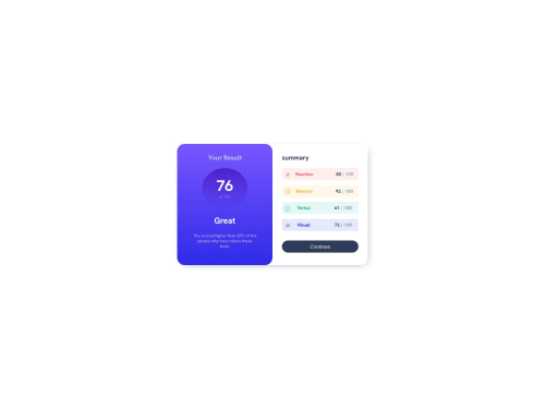
Report card landing page using only CSS

Solution retrospective
I am facing difficulty in understanding the Break-Points for Responsiveness.
Please log in to post a comment
Log in with GitHubCommunity feedback
- @gfunk77
Nice work on your solution. It looks fantastic. I'll try to give a very, very basic suggestion on breakpoints that hopefully moves your understand up at least a tiny bit.
After you design your site and it looks good either on desktop or mobile, use your dev tools to shrink or expand your screen. Keep an eye on the width. The moment your design doesn't look good anymore (it breaks), that is your breakpoint. Write a media query with the breaking width. In this case, say my design looks good on mobile and when I expand it falls apart at 600px, I would do:
@media (min-width: 600px) { ...styles }This means that the styles I apply inside the media query will take effect only when the screen width is 600px or larger.I'd recommend creating something super simple like a div with a few <p> tags. Then play around with the screen sizes and media queries to see how you can change it based on the screen size. That way you'll be focusing on the media query and not all the details of a larger design.
I hope this helps a little.
Marked as helpful

Join our Discord community
Join thousands of Frontend Mentor community members taking the challenges, sharing resources, helping each other, and chatting about all things front-end!
Join our Discord