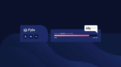
Responsie Fylo data storage component [BEM + SASS + Animation]

Solution retrospective
Hello There! 👋🏽
Here is my solution for this challenge!
Built Using⚒️ :
- Flexbox
- CSS Grid (few lines)
- SASS/SCSS
- BEM
- Animation
Question🙋 :
I am finding it hard to style the white round element on the meter from the design, you could see from my SASS file that I had to comment out some styles for it (check Git edit history better). Do you have any idea on how to do that?
...
Feedbacks on how I can improve my code would be highly appreciated! 🙏🏽
Thank You, and Keep coding! 👨🏽💻
Please log in to post a comment
Log in with GitHubCommunity feedback
- @manjubhaskar02
Congratulations on taking up this challenge!
I think you can simply put this element..
This was my code.
HTML
 <div class="progress-bar">
        <div class="progress">
          <div class="round"></div>
        </div>
      </div>
CSS
.progress-bar {
    background-color: var(--Very-Dark-Blue);
    width: 100%;
    height: 18px;
    border-radius: 50px;
    padding: 0px 2px;
}

.progress {
    background-image: linear-gradient(to right, hsl(6, 100%, 80%), hsl(335, 100%, 65%));
    width: 75%;
    height: 16px;
    border-radius: 50px;
    position:relative;
    }

.round {
    position: absolute;
    background-color: white;
    width: 15px;
    height: 15px;
    right: 0px;
    border-radius: 100%;
}
I think just a class round and adding its styling inside the meter element will help you.
Hoping this would be helpful for you!
Happy Coding Journey!

Join our Discord community
Join thousands of Frontend Mentor community members taking the challenges, sharing resources, helping each other, and chatting about all things front-end!
Join our Discord