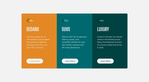
Responsive 3 card column with Flexbox

Solution retrospective
I am most proud of my progress with doing these challenges. This took me less than an hour to do whereas before I might have spent 2 hours on a simple design.
What challenges did you encounter, and how did you overcome them?One challenge I encountered was getting the sizing of the cards on smaller screens to be contained within the padding on the body. Turns out giving the body a min-height: 100vh instead of height: 100vh did the trick.
What specific areas of your project would you like help with?Any feedback is appreciated!
Please log in to post a comment
Log in with GitHubCommunity feedback
- @alaa-mekibes
Good job, you use semantic elements on html and rem units on css 🎉, just a few points to fix :
- Separate your CSS code: Move your CSS code into a separate file (e.g., style.css) and link it to your HTML file using:
<link rel="stylesheet" href="YOUR PATH HERE">- Update Your README File
Start by using the provided README template included in the starter file. Customize it to enhance clarity and professionalism.
- Use css variables like this :
:root {
    --bg-color: hsl(210, 46%, 95%);
    /* Add your other colors here */
}

body {
    background-color: var(--bg-color);
    /* Other properties */
}

Join our Discord community
Join thousands of Frontend Mentor community members taking the challenges, sharing resources, helping each other, and chatting about all things front-end!
Join our Discord