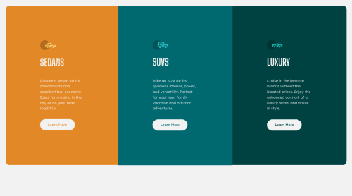
Responsive 3 Column Preview Card Using CSS Flexbox

Solution retrospective
Hi,
I hope this is mostly correct. One issue I am having is that the card heights are different when changing the size of the page. Once the page reaches a certain width, the cards are fine, but until then they seem to be different heights. Is there anything I can please do to change this?
I also think I may have used too many classes, and could have used more specific selectors such as nth of type selectors or descendent selectors. Is the way I have done it easily readable?, or should I adjust it to make it easier to read and change for other people?
Thank you very much, any feedback is definitely welcome.
Please log in to post a comment
Log in with GitHubCommunity feedback
No feedback yet. Be the first to give feedback on Paisley's solution.
Join our Discord community
Join thousands of Frontend Mentor community members taking the challenges, sharing resources, helping each other, and chatting about all things front-end!
Join our Discord