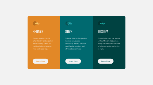
Submitted over 2 years agoA solution to the 3-column preview card component challenge
Responsive 3 column preview card using grid
accessibility, cube-css

@kennylun123
Solution retrospective
Hi everyone, this is my solution of "3 column preview card".
- I learned CSS property 'transition'.
transition: background-color 200ms ease-in-out, color 200ms ease-in-out;
- I found that using
grid-template-rows: 1fr 1fr 1fr;will share equal amount of width for each item. In this situation, it is better than usingflex-direction: row;.
Code
Please log in to post a comment
Log in with GitHubCommunity feedback
No feedback yet. Be the first to give feedback on Kenny Ng's solution.
Join our Discord community
Join thousands of Frontend Mentor community members taking the challenges, sharing resources, helping each other, and chatting about all things front-end!
Join our Discord