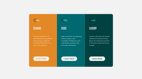
Responsive 3 column product page using HTML, CSS and Bootstrap

Please log in to post a comment
Log in with GitHubCommunity feedback
- @correlucas
👾Hello again Raz, congratulations for your new solution!
I was looking your previous solution and I've some tips for you:
First of all you can improve a bit the html semantics replacing the card divs with
article. Remember to use div only for small blocks of content and for the bigger blocks choose meaningful tags.You've used
<br>to break the paragraph line but this is not a best practice because it gives your solution a strange behavior when the card grow in the mobile version and the text didnt grow to fit the card, you can control the paragraph size usingmax-width: 400pxto make the text break lines or even use a limit of characters likemax-width: 40chto have each line having maximum 40 chracthres.If you want to see my solution for the same challenge, here's the link: https://www.frontendmentor.io/solutions/3-column-preview-card-vanilla-css-custom-design-and-hover-states-e5uAfmUT71
👋 I hope this helps you and happy coding!
Marked as helpful

Join our Discord community
Join thousands of Frontend Mentor community members taking the challenges, sharing resources, helping each other, and chatting about all things front-end!
Join our Discord