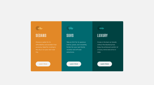
Responsive 3 columns card component

Solution retrospective
I'm still a newbie, dont judge me stricktly :)
I stucked with some questions here.
scema of the body:
"body"
"div.container"
"main.card"
"div.copyright"
"/ div.container"
"/ body"
First of all, width and height to make the card component right in the center of the screen (+ "div.copyright" always at the bottom).
So, am I right to give the "div.container" (that is a only child of a <body>) hight of 100vh. In this case whole contains will take 100 screen height, and with "display: flex" I cant disperse 2 child ("main.card" itself and "div.copyright") on the screen.
In the other hand, I have to add "margin: 0 auto" and to the "div.container" and to it's first child "main.card" to center vertically.
Second, CSS variables. I gave button { background: hsl(31, 77%, 52%); /* to apply the background color*/ --class-item-bg: hsl(31, 77%, 52%); /* to reuse this color later at the :hover state*/ it works but I'm sure there is an other much more clewer way to do it.
Third, I add all the parameters of all the component at the top of the .css file. Is it useful/ necessary in a real life project?
Please log in to post a comment
Log in with GitHubCommunity feedback
No feedback yet. Be the first to give feedback on NadiaFr's solution.
Join our Discord community
Join thousands of Frontend Mentor community members taking the challenges, sharing resources, helping each other, and chatting about all things front-end!
Join our Discord