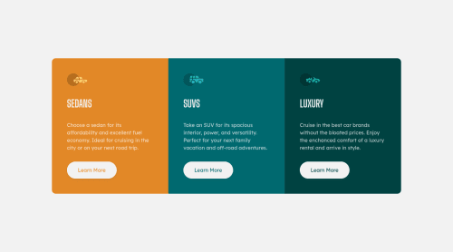
Submitted over 2 years agoA solution to the 3-column preview card component challenge
Responsive 3column card component using flex grid and scss

@ValentinYankov
Solution retrospective
Struggled to do the vertical centering of the cards for mobile/tablet sizes untill i added the margin-block: 2rem rule in my wrapper class and removing it for the desktop size. Justify-content: center and align-items: center did the job for desktop but not for mobile. Wonder if there is an way of doing this without the margin-block rule for mobile. Feedback would be appreciated.
Code
Loading...
Please log in to post a comment
Log in with GitHubCommunity feedback
No feedback yet. Be the first to give feedback on Valentin Yankov's solution.
Join our Discord community
Join thousands of Frontend Mentor community members taking the challenges, sharing resources, helping each other, and chatting about all things front-end!
Join our Discord