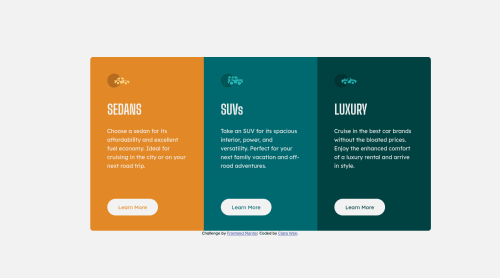
Responsive 3-column component using CSS flex box

Solution retrospective
This is my second CSS/HTML challenge and I began to feel more comfortable using CSS flexbox and playing around with its properties. Unlike the first project, I took time to think about the steps of implementation of each element and really started to see the whole card changing from a blank to a skeleton and finally full-fledged in much faster pace. It was definitely a great experience!
I'm not if I was following the best practice in terms of HTML semantic or whether I used too many class selectors in CSS. Any feedback is highly appreciated!
Please log in to post a comment
Log in with GitHubCommunity feedback
No feedback yet. Be the first to give feedback on Clara Wen's solution.
Join our Discord community
Join thousands of Frontend Mentor community members taking the challenges, sharing resources, helping each other, and chatting about all things front-end!
Join our Discord