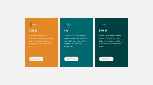
Submitted over 3 years agoA solution to the 3-column preview card component challenge
Responsive 3-column preview card layout using CSS Grid

@iqra0001
Solution retrospective
Are the cards completely responsive? What are some of the best ways to center a div horizontally as well as vertically?
Code
Loading...
Please log in to post a comment
Log in with GitHubCommunity feedback
No feedback yet. Be the first to give feedback on Iqra Zaheer's solution.
Join our Discord community
Join thousands of Frontend Mentor community members taking the challenges, sharing resources, helping each other, and chatting about all things front-end!
Join our Discord