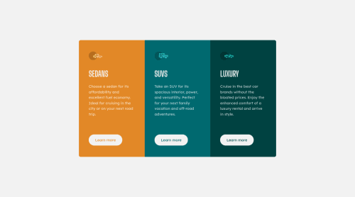
Not Found
Not Found
Not Found
Not Found
Not Found
Not Found
Not Found
Not Found
Not Found
Not Found
Not Found
Not Found
Not Found
Not Found
Not Found
Not Found
Not Found
Not Found
Not Found
Not Found

Submitted

Responsive 3-Column Preview Card using grid-template-areas

#bem

@matthew-millard

Desktop design screenshot for the 3-column preview card component coding challenge

This is a solution for...

  • HTML
  • CSS
1newbie
View challenge

Design comparison


SolutionDesign

Solution retrospective


Is the correct way to center the component both horizontally and vertically as the contents are overflowing the viewport height? I set the top: 0; applied equal padding on both top and bottom and set translate(-50%, 0).

    position: absolute;
    top: 0;
    left:50%;
    transform: translate(-50%, 0%);
    padding: 2rem 0;
    width: 90%;
    max-width: 400px;
    margin: 0 auto;
    display: grid;
    grid-template-columns: 100%;
    grid-template-rows: auto;
    grid-template-areas:
    'sedans'
    'suvs'
    'luxury';
}```

Community feedback

Vanza Setia 27,855

@vanzasetia

Posted

Hi, Matthew Millard! 👋

I recommend making the <body> element a flex container of the cards to place the cards in the middle of the page. This modern technique is more robust than absolute positioning and has less code to write.

I notice that there is a hidden <h1><h1 class="hidden">3-Column Preview Card Component</h1>. But, it is not a visually hidden <h1>—it is completely a hidden <h1>. It means that the element is not visible to users and assistive technologies. In other words, it is the same as the page not having <h1>.

The reason for that is because visibility: hidden is removing the element from being accessible—removing the element from the accessibility tree.

You should know the correct visually hidden styling. This way, the <h1> would still be accessible.

I hope you find this useful. 🙂

Marked as helpful

1

@matthew-millard

Posted

@vanzasetia Thank you so much for taking the time to give me feedback and providing those resources on accessibility. I have spent a big part of today going down the accessibility rabbit hole :)

Cheers

Matthew

0
Vanza Setia 27,855

@vanzasetia

Posted

@matthew-millard

You are welcome! Good luck with learning web accessibility! 👍

0

@SameerJS6

Posted

The problem your facing is very basic that anyone can face, but to solve it all you have to do is use the modern solution to align content i.e. css display: grid or css display: flex. But the nonetheless, below is the solution for your problem

Here is the solution,

  • To center the content in the whole
body {
 display: grid;
 min-height: 100vh;
 place-content: center;
}
  • Don't hide the h1 title
h1 {
 color: black;
 text-align: center;
 visibility: visible;
} 
  • For the Main Section set the max-width here
main {
 padding: 1rem;
 max-width: 900px;
 margin-inline: auto;
}
  • Remove all the styling that you did in the cards section, and add this one mentioned below:-
.cards {
 display: grid;
}
  • For making the 3 columns layout on desktop
@media (min-width: 768px) {
.cards {
 grid-template-columns: repeat(3, 1fr)
}

Then adjust the column's border-radius according to the layout i.e. either for mobile or desktop

  • Hope it helps you to understand the problem and let me know if this solved your problem

Marked as helpful

1

@matthew-millard

Posted

@SameerJS6 Huge thanks Sameer for taking the time to give such detailed feedback. I have now rectified the code. I understand why my approach was over-kill and more prone to cause bugs too! :)

Cheers

Matthew

1

Please log in to post a comment

Log in with GitHub
Discord logo

Join our Discord community

Join thousands of Frontend Mentor community members taking the challenges, sharing resources, helping each other, and chatting about all things front-end!

Join our Discord