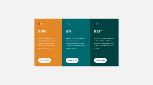
Responsive 3-Column Preview Cards using Vanilla CSS and HTML

Solution retrospective
Any suggestions for how to improve my code are greatly appreciated! I apologize for not having any specific questions; it's late and my brain worked just long enough to get this finished before shutting down entirely.
Please log in to post a comment
Log in with GitHubCommunity feedback
- Account deleted
Hey there! 👋 Here are some suggestions to help improve your code:
- The headings in your component are being used incorrectly❌. Since the
h1heading can only be used once ⚠️, it is always given to the heading with the highest level of importance. This component has three headings of equal importance, so the best option would be to use anh2heading ✅ since it is reusable and it will give each heading the same level of importance.
- Your "buttons" were created with the incorrect element ❌. When the user clicks on the button they should be directed to a different part of you site. The
anchor tagwill achieve this.
More Info:📚
- ALWAYS Implement a "Mobile First" approach 📱 > 🖥
Mobile devices are now the dominant 👑 way in which people browse the web. So when building your content, you will start building with small screen sizes (starting at 320px) and work your way to larger screens using
min-width.More Info: 📚
If you have any questions or need further clarification, you can always check out my submission and/or feel free to reach out to me.
Happy Coding! 👾
Marked as helpful - The headings in your component are being used incorrectly❌. Since the
- @Mouradis
the quick advice i can give you is that you made your media query too early about 900px you should but it about max-width : 480px (mobile size) or if you want 780px (tablets size)

Join our Discord community
Join thousands of Frontend Mentor community members taking the challenges, sharing resources, helping each other, and chatting about all things front-end!
Join our Discord