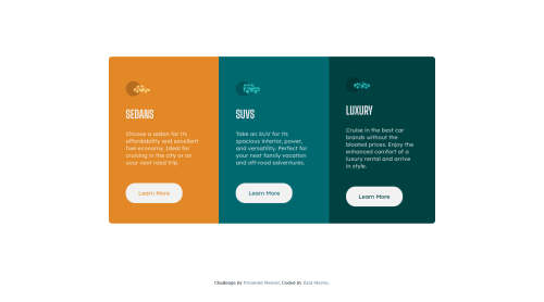
Responsive 3-column-preview-card-component using grid

Solution retrospective
I am currently exploring the css grid property and I am not fully comfortable using it. However I would appreciate it if anyone can give me feedback of how well I used this property and what I should focus on improving. TIA!
Please log in to post a comment
Log in with GitHubCommunity feedback
- @vanzasetia
👋Hi Zaid! My name is Vanza!
In my opinion, you're doing 👍 great job on using grid properties and the
minmax()function. I have one tip for you. You can removegrid-template-columns: 1fr;andgrid-template-rows: repeat(3, 1fr);since it is by default already one column and you can do multiple rows without specified it..card-container { margin: 50px 5%; max-width: 100%; display: grid; grid-template-rows: repeat(3, 1fr); grid-template-columns: 1fr; }What I encouraged you to focus is that, keep practicing your CSS Grid Skill by doing challenge from Frontend Mentor until you comfortable using those grid properties.
That's it! Hopefully this is helpful!
Marked as helpful

Join our Discord community
Join thousands of Frontend Mentor community members taking the challenges, sharing resources, helping each other, and chatting about all things front-end!
Join our Discord