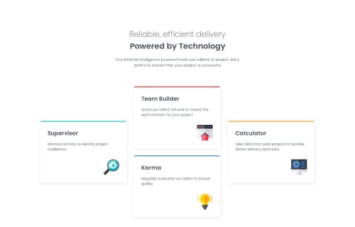
Submitted 5 months agoA solution to the Four card feature section challenge
Responsive 4 Card Feature Section (Sass, Grid, Flex)
sass/scss

@ikokolius
Solution retrospective
What are you most proud of, and what would you do differently next time?
I am proud to make a rather similar design with CSS Grid
What specific areas of your project would you like help with?I would appreciate any tips and feedback on how I can improve the responsiveness of the page
Code
Please log in to post a comment
Log in with GitHubCommunity feedback
- P@KonradJam
Hi @ikokolius! I’m happy to review your solution :)
- The first point is that your tablet layout doesn’t exactly match the challenge requirements. To achieve this, you need to adjust
grid-template-rowsandgrid-template-columnsbased on the screen size and use column/row spanning accordingly. - The cards should also be fluid rather than having a fixed size.
- There is also an issue with HTML semantics. The
<article>tag should be used for independent content. In my opinion, it's better to wrap the entire page in an<article>tag and place the cards inside a<section>.
I think the best approach would be for you to review my solution and then reach out to me or reply to this comment if you need further explanation :)
Marked as helpful - The first point is that your tablet layout doesn’t exactly match the challenge requirements. To achieve this, you need to adjust

Join our Discord community
Join thousands of Frontend Mentor community members taking the challenges, sharing resources, helping each other, and chatting about all things front-end!
Join our Discord