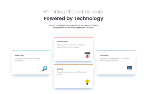
Responsive 4 Card Section using CSS Grid

Solution retrospective
I'm particularly proud of executing the complex layout with CSS Grid. Returning to grid after some time away, I was pleased with how effectively it handled the responsive design challenge.
For future projects, I'd focus on refining my typography implementation. The fluid typography approach using clamp() functions remains an area where I'm still developing my skills and seeking greater mastery.
What challenges did you encounter, and how did you overcome them?My main challenge was implementing the responsive diamond-shaped card layout that transforms seamlessly across breakpoints. Initially, I struggled with the grid-area syntax for precise card positioning. I overcame this by sketching the grid structure on paper first, then methodically testing different grid-template configurations until I found the optimal balance. The path issues during deployment also proved challenging, requiring me to adjust from absolute to relative paths for the SVG icons.
What specific areas of your project would you like help with?I'd appreciate guidance on implementing fluid typography more effectively. While I've used clamp() functions for responsive text sizing, I'm unsure if my approach is optimal. Additionally, I'm interested in learning more efficient methods for maintaining consistent spacing ratios across different screen sizes. Finally, I'd welcome feedback on my CSS organization, particularly whether my text preset system could be structured more efficiently.
Please log in to post a comment
Log in with GitHubCommunity feedback
No feedback yet. Be the first to give feedback on Kyle Mulqueen's solution.
Join our Discord community
Join thousands of Frontend Mentor community members taking the challenges, sharing resources, helping each other, and chatting about all things front-end!
Join our Discord