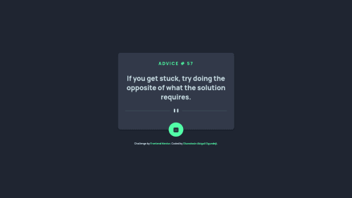
Responsive Advice Generator App Using HTML, CSS, JAVASCRIPT, and API

Solution retrospective
Hi, this is my first Javascript project and I will love feedback on the following roadblocks:
What I found difficult while building the project? Positioning the click button in the middle. I know i am supposed to use absolute after positioning the main div as relative. However, I found it had placing the image to the middle.
Now, is there a covention on browswer use? I used Chrome and Firefox for the project but I realised they all have different output when it comes to responsiveness. Is there a cheat sheet to build a project that is responsive on all browsers? Kindly give suggestions.
Which area of my code am I u sure of? The responsiveness.
Question about best practices? Like I mentioned above, guideliines on browser responsives.
Please log in to post a comment
Log in with GitHubCommunity feedback
- @Auddity
Hi there, good job.
Best practice for building responsive sites is to build it mobile-first. So do all your styling based on a mobile view-port. More and more people are viewing sites on mobile devices, so it's good to ensure your app or website looks best in there.
You can use dev tools and shrink the width of your screen or use the toggle device button and select a device to get an idea of what the site will look like on that device. When you start work on the larger view-ports you'll use min-width in your media queries instead of max-width.
Also, don't worry about a width smaller than 375px. The smallest cell phones have at least that wide of a viewport. Other popular view-ports are 768 (iPad), and 1024(iPad Pro). So depending on the content of your web-site you may want to use those width's as media-query break points.
Keep practicing!
Marked as helpful

Join our Discord community
Join thousands of Frontend Mentor community members taking the challenges, sharing resources, helping each other, and chatting about all things front-end!
Join our Discord