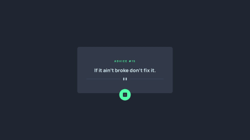
Responsive and best practices using vanilla CSS and Js.

Solution retrospective
Nothing really, however, I added a tiny thing, which is dice rotation, and also, initial loading effect using opacity, which might give a nice effect.
What challenges did you encounter, and how did you overcome them?I was struggling to avoid rapid API requests as it takes a few milliseconds to load advice, so I could disable the mouse and added a condition to prevent multiple calls while a request is being made already.
What specific areas of your project would you like help with?There is still one issue that dice rotates even though the API call is not being made, as I prevented it using a condition (isFetching). I am thinking of some simple yet effective logic and will implement it soon. I am open to feedback.
Please log in to post a comment
Log in with GitHubCommunity feedback
- @MarziaJalili
Flawlessly done! 💯
🌟 A tiny little tweak?
✅ You could consider using the clamp() function for responsive font sizes instead of setting different sizes in media queries.
✅ Here's an example of how it works:
/* Syntax of clamp() */
clamp(minimum, preferred, maximum)

/* Example...*/
h1 {
  font-size: clamp(1.5rem, 5vw, 3rem);
}
I literally failed to spot any mistakes! 😁

Join our Discord community
Join thousands of Frontend Mentor community members taking the challenges, sharing resources, helping each other, and chatting about all things front-end!
Join our Discord