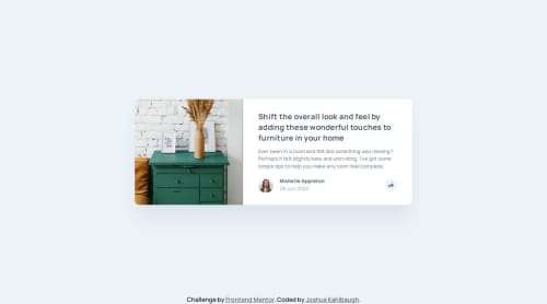
Responsive Article Preview Card

Solution retrospective
I'm most proud of how the popups are working based on different screen sizes. I would possibly change the way that I used an img tag for some icons because my use of an inline svg tag for the share icon was simpler.
What challenges did you encounter, and how did you overcome them?One challenge was that my icons would get clipped in half on mobile because I set an explicit height and width for the button containing it. I fixed this by setting a padding specifically for the share button containing the icon:
.share__button {
    padding: 0.59375rem 0.53125rem;
    border-radius: 100%;
}
I don't know if this is the most conventional way to solve that problem, but that's what I ended up doing.
What specific areas of your project would you like help with?I'd like help on setting the box shadow for the triangle attached to the popup when you press the share icon on desktop. Will it be any different than attaching a box shadow to any other div?
Also, if anybody has insight into why my icons were being clipped before my fix that would be appreciated!
Please log in to post a comment
Log in with GitHubCommunity feedback
No feedback yet. Be the first to give feedback on Josh Kahlbaugh's solution.
Join our Discord community
Join thousands of Frontend Mentor community members taking the challenges, sharing resources, helping each other, and chatting about all things front-end!
Join our Discord