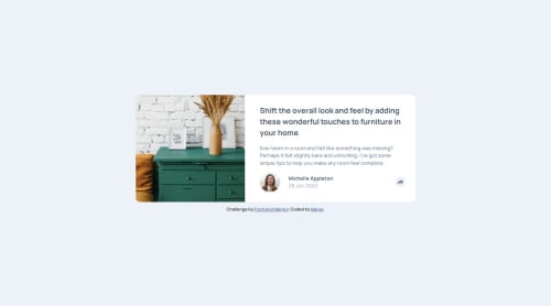
Submitted about 1 year agoA solution to the Article preview component challenge
Responsive Article Preview Component
accessibility, pure-css

@manav-sharma69
Solution retrospective
What challenges did you encounter, and how did you overcome them?
Designing that share box (for desktop design) was something I did for the first time. It was challenging. Now it looks fairly simple. Although, it's a bit hacky 😅
What specific areas of your project would you like help with?@media (min-width: 769px){ ... .popup{ justify-content: center; position: absolute; bottom: 90%; right: -2vw; left: 23vw; background-color: var(--very-dark-grayish-blue); padding: 1.25rem 2.5rem; border-radius: 10px; } .icon:hover{ cursor: pointer; } button::before{ display: var(--btnStyle); position: absolute; bottom: 80%; right: 7%; content: ""; inline-size: 0; block-size: 0; border-top: 10px solid var(--very-dark-grayish-blue); border-inline: 10px solid transparent; } } @media (min-width: 920px){ .popup{ right: -4vw; } } @media (min-width: 1040px){ .popup{ right: -6vw; } } @media (min-width: 1080px){ .popup{ right: -20%; left: unset; } }
This is styling I added to make that share box responsive. If there's a better way to design the component with shorter/better CSS, please share in the comments.
Code
Loading...
Please log in to post a comment
Log in with GitHubCommunity feedback
No feedback yet. Be the first to give feedback on Manav's solution.
Join our Discord community
Join thousands of Frontend Mentor community members taking the challenges, sharing resources, helping each other, and chatting about all things front-end!
Join our Discord