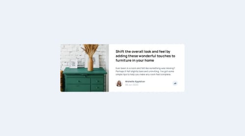
Responsive Article Preview Component

Please log in to post a comment
Log in with GitHubCommunity feedback
- @Gentlestan
Great job on your project! Everything looks fantastic, and the design works really well. The use of semantic HTML is spot-on, and the accessibility is solid. Kudos for that!
However, there’s one area I think you could adjust:
Responsive Design (Breakpoints): In your current version, the mobile and tablet designs are quite similar, but in the actual design, the tablet and desktop layouts should be nearly identical with only slight differences, while the mobile layout is different. It looks like the tablet and desktop layouts in your solution are more similar to each other, but there should be a noticeable difference between the mobile layout and the tablet/desktop designs. You might want to recheck your breakpoints and ensure that the tablet and desktop views are closer to each other, while the mobile version remains distinct.

Join our Discord community
Join thousands of Frontend Mentor community members taking the challenges, sharing resources, helping each other, and chatting about all things front-end!
Join our Discord