


Lucas 👾• 104,580
@correlucas
Posted
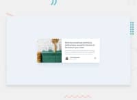
👾Hello Daniel, congratulations for your new solution!
Your solutions is really amazing, the design is all perfect. The only thing I think you can really change is the size of the component in the desktop version that is around max-width: 1110px and the button share that is losing its proportion when the screen scales. A display: block and max-width: 50px should get this work done,
.article-card {
    max-width: 1110px;
    grid-template-rows: 1fr;
    grid-template-columns: .7fr 1fr;
    grid-template-areas: 'article-image article-card-body';
    box-shadow: 0 10px 25px 5px rgb(183 215 245 / 62%);
}
👋 I hope this helps you and happy coding!
0
