Skip to content
  • Unlock Pro
  • Log in with GitHub
Solution
Submitted 4 months ago

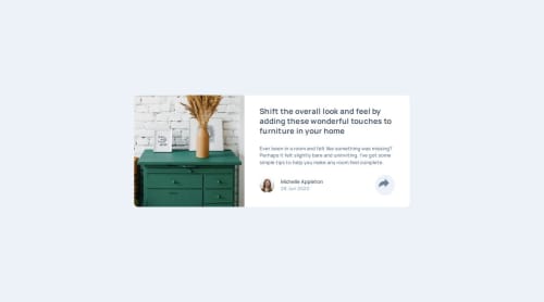
Responsive article preview component

P
Mihailo Sparic•300
@MihailoSparic01
A solution to the Article preview component challenge
View live sitePreview (opens in new tab)View codeCode (opens in new tab)

Solution retrospective


What are you most proud of, and what would you do differently next time?

Next time, I won't underestimate any challenge, no matter how easy it seems. Because of my arrogance, I was in a hurry to finish it so I could jump on to a new challenge, and I messed everything up, so it took a lot longer than it should

What challenges did you encounter, and how did you overcome them?

Working with pseudo-elements to create a small triangle below the share button and center it, as padding wasn’t included when using left: 50% and translateX(-50%). I had to experiment with different values manually.

What specific areas of your project would you like help with?

General layout in HTML and JS Also, if you have any other suggestions, please feel free to comment. I will be happy to listen to and apply every advice

Code
Select a file

Please log in to post a comment

Log in with GitHub

Community feedback

  • Kuvashnee Naidoo•450
    @KuvashneeNaidoo
    Posted 4 months ago

    Hi @MihailoSparic01

    Excellent work on creating the article preview component. I commend you on managing the display and hiding of the "share" section when the share icon is clicked. It enhances the interactivity of the component. ⭐👏⭐

    One aspect I recommend is adjusting the preview card to be centered on the page, as it's currently slightly above the center. To achieve this, you can modify the CSS for the body element:

    • Use flexbox on the body to center the card both vertically and horizontally.
    • Remove the padding-top: 16rem; to prevent the card from being pushed down.
    • Apply justify-content: center to horizontally align the content within the flex container, keeping it centered across the page.
    • Apply align-items: center to vertically align the content, ensuring the card is centered from top to bottom.
    • Use height: 100vh to ensure that the body takes up the full viewport height.
    • Use margin: 0 to remove any default margin that might offset the card.
    body {
      background-color: #ecf2f8;
      display: flex;
      justify-content: center;
      align-items: center;
      height: 100vh;
      margin: 0;
    }
    

    Otherwise, well done completing this solution! 🚀🚀🚀

    Happy coding :)

    Marked as helpful

Join our Discord community

Join thousands of Frontend Mentor community members taking the challenges, sharing resources, helping each other, and chatting about all things front-end!

Join our Discord
Frontend Mentor logo

Stay up to datewith new challenges, featured solutions, selected articles, and our latest news

Frontend Mentor

  • Unlock Pro
  • Contact us
  • FAQs
  • Become a partner

Explore

  • Learning paths
  • Challenges
  • Solutions
  • Articles

Community

  • Discord
  • Guidelines

For companies

  • Hire developers
  • Train developers
© Frontend Mentor 2019 - 2025
  • Terms
  • Cookie Policy
  • Privacy Policy
  • License

Oops! 😬

You need to be logged in before you can do that.

Log in with GitHub

Oops! 😬

You need to be logged in before you can do that.

Log in with GitHub

How does the accessibility report work?

When a solution is submitted, we use axe-core to run an automated audit of your code.

This picks out common accessibility issues like not using semantic HTML and not having proper heading hierarchies, among others.

This automated audit is fairly surface level, so we encourage to you review the project and code in more detail with accessibility best practices in mind.

How does the CSS report work?

When a solution is submitted, we use stylelint to run an automated check on the CSS code.

We've added some of our own linting rules based on recommended best practices. These rules are prefixed with frontend-mentor/ which you'll see at the top of each issue in the report.

The report will audit all CSS, SCSS and Less files in your repository.

How does the HTML validation report work?

When a solution is submitted, we use html-validate to run an automated check on the HTML code.

The report picks out common HTML issues such as not using headings within section elements and incorrect nesting of elements, among others.

Note that the report can pick up “invalid” attributes, which some frameworks automatically add to the HTML. These attributes are crucial for how the frameworks function, although they’re technically not valid HTML. As such, some projects can show up with many HTML validation errors, which are benign and are a necessary part of the framework.

How does the JavaScript validation report work?

When a solution is submitted, we use eslint to run an automated check on the JavaScript code.

The report picks out common JavaScript issues such as not using semicolons and using var instead of let or const, among others.

The report will audit all JS and JSX files in your repository. We currently do not support Typescript or other frontend frameworks.

Oops! 😬

You need to be logged in before you can do that.

Log in with GitHub