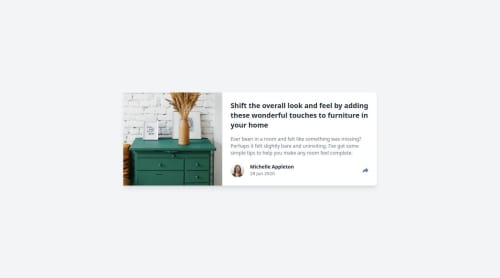
Responsive article preview component using Tailwind CSS and JavaScript

Solution retrospective
I’m most proud of implementing a responsive share menu that adapts seamlessly between mobile and desktop layouts, a core challenge of the Frontend Mentor project. Using JavaScript, I created a toggle system where the share button reveals social media links, replacing the author section on mobile and showing a popover with a triangle pointer on desktop. The isMobileView() function was key to handling these layout differences, and I’m thrilled with how the resize event listener ensures the UI resets correctly when switching screen sizes. Styling the menu with Tailwind CSS, especially the desktop triangle pointer using pseudo-elements ([&::after]), was a highlight, as it perfectly matched the design. Adding aria-label attributes to the share button and social links boosted accessibility, making the component more inclusive. Seeing the toggle work smoothly across devices while maintaining a clean, semantic HTML structure felt like a major win.
Next time, I’d add smooth animations to the share menu’s appearance, such as a fade or slide effect using Tailwind’s transition classes, to make the toggle more engaging. I’d also enhance accessibility by adding aria-expanded to the share button and managing focus for keyboard users, ensuring the first social link is focused when the menu opens. My JavaScript could be more modular—splitting the toggle logic into separate functions for opening and closing the menu would improve maintainability. I’d also refine the resize event listener to avoid unnecessary DOM updates by checking the menu’s current state. Finally, I’d test the component earlier on more devices and browsers to catch edge cases, like the share menu’s positioning on smaller desktop screens, and consider debouncing the resize handler for better performance.
What challenges did you encounter, and how did you overcome them?Responsive Share Menu: Positioning the share menu (mobile: full-width bar, desktop: popover with triangle) was tough. I used Tailwind’s md: classes and isMobileView() in JavaScript, testing with DevTools to fine-tune md:right-[-215px] and pseudo-elements ([&::after]).
Share Menu Toggle: Toggling the menu (mobile: hide author, desktop: popover) caused layout glitches. I implemented device-specific logic with classList.toggle('hidden') and a mobile close button, debugging with console logs to ensure smooth transitions.
Tailwind CSS: Mastering Tailwind’s utilities (e.g., [&::after]:border-t-gray-700) was challenging. I followed Tailwind’s docs, building incrementally and checking in DevTools.
Triangle Pointer: Positioning the triangle (rotate-45) was tricky. I used trial-and-error with left-1/2 and translate-x-1/2, verifying alignment in DevTools.
What specific areas of your project would you like help with?Animations for Share Menu: Issue: Abrupt toggle with hidden.
Help: Add fade/scale animation.
Solution:
html

<div id="share-menu" class="hidden opacity-0 scale-95 transition-all duration-300 ...">
js

shareBtn.addEventListener('click
Please log in to post a comment
Log in with GitHubCommunity feedback
- P@devmd1997
Good use of tailwind to style your components. The javascript code is very clean and readable. I like how you utilized the same component for the share button toggle. Very good design!

Join our Discord community
Join thousands of Frontend Mentor community members taking the challenges, sharing resources, helping each other, and chatting about all things front-end!
Join our Discord